Wasn't in the mood to mess with painting so I chose to work this one using Ipad / Procreate and the HB brush tool. Good practice with values.
Tuesday, March 24, 2020
Mockingbird Gathering Nest Material
Spring is such a busy time and joy to watch. We learned a pair of Mockingbirds are building a nest in our Bougainvillea in the front yard. No idea if male or female but this one was right outside my window gathering twigs it could find.
Wasn't in the mood to mess with painting so I chose to work this one using Ipad / Procreate and the HB brush tool. Good practice with values.
Monday, March 23, 2020
Birds and the Bees
Early this morning, as I drank my first cup of coffee, I watched this Brown Thrasher "thrashing" at the ground to move leaves and debris looking for food. Another was checking out the flat feeder of sunflower seeds.
This guy was up under the Azalea bush near my window taking a break. He sat there for quite awhile before returning to task at hand giving me plenty of opportunity to take several photos.
I haven't learned to tell the difference yet between male and female. I understand that if guarding a nest, they can be quite aggressive attacking people and dogs. They are quite large song birds and one I wouldn't want dive-bombing me with that large beak they have.
During the summer we don't see them around the feeders like we do during late winter and early spring.
Journal with Fabriano 140lb HP / Pilot Prera w/#41 Brown / DS watercolors
Yesterday I was looking out the window when a bumble or carpenter bee hit the window. Not just once but twice. Once he realized there was an obstruction there, he went on his way. You would think the first time he hit the window, he would have moved on.
The bees never appear to be stunned like the occasional bird that hits the window. If we find a bird stunned and on the ground, we will move the bird to the back yard so our neighbor's cat can't get him while he recovers.
Journal with Arches 140lb CP / Pilot Prera w/#41 Brown for sketching and Lamy with Doc Ink for writing (the Lamy handles the toothy paper better when adding notes) / DS watercolors
This guy was up under the Azalea bush near my window taking a break. He sat there for quite awhile before returning to task at hand giving me plenty of opportunity to take several photos.
I haven't learned to tell the difference yet between male and female. I understand that if guarding a nest, they can be quite aggressive attacking people and dogs. They are quite large song birds and one I wouldn't want dive-bombing me with that large beak they have.
During the summer we don't see them around the feeders like we do during late winter and early spring.
Journal with Fabriano 140lb HP / Pilot Prera w/#41 Brown / DS watercolors
Yesterday I was looking out the window when a bumble or carpenter bee hit the window. Not just once but twice. Once he realized there was an obstruction there, he went on his way. You would think the first time he hit the window, he would have moved on.
The bees never appear to be stunned like the occasional bird that hits the window. If we find a bird stunned and on the ground, we will move the bird to the back yard so our neighbor's cat can't get him while he recovers.
Journal with Arches 140lb CP / Pilot Prera w/#41 Brown for sketching and Lamy with Doc Ink for writing (the Lamy handles the toothy paper better when adding notes) / DS watercolors
Sunday, March 22, 2020
Playing - New Shadow Mix
Painting shadows.......particularly cast shadows has always been an issue for me. Putting in shadows tend to intimidate me for some reason..........no matter how often I practice.
Most often it has to do with the color of the shadows never turning out how I like. Either too blue / too lavender, etc., too stark or streaky looking. Personally I prefer subtle shadows over bold.
I've tried mixing complementary colors together, mixing Blues and Siennas or Umbers together, and even using premixed tube shadow colors. I seldom felt satisfied with the results.
My friend, Fay, shared a combination she recently tried using Potters Pink with Cerulean Blue. I didn't have Potters Pink but instead Opera. I tried that and although I could come close to her gray mixes, the results were a bit "too much.....too intense" for my liking. Aliz plus Cer Blue didn't quite make it either.
Finally, I picked up a tube of Potters Pink and have to say I love the results with it and Cerulean Blue. I also like the granulation achieved which to me adds a bit of interest.
This is my playing a bit this morning shading white objects. Painted in Journal with Arches 140lb CP
Most often it has to do with the color of the shadows never turning out how I like. Either too blue / too lavender, etc., too stark or streaky looking. Personally I prefer subtle shadows over bold.I've tried mixing complementary colors together, mixing Blues and Siennas or Umbers together, and even using premixed tube shadow colors. I seldom felt satisfied with the results.
My friend, Fay, shared a combination she recently tried using Potters Pink with Cerulean Blue. I didn't have Potters Pink but instead Opera. I tried that and although I could come close to her gray mixes, the results were a bit "too much.....too intense" for my liking. Aliz plus Cer Blue didn't quite make it either.
Finally, I picked up a tube of Potters Pink and have to say I love the results with it and Cerulean Blue. I also like the granulation achieved which to me adds a bit of interest.
This is my playing a bit this morning shading white objects. Painted in Journal with Arches 140lb CP
Friday, March 20, 2020
Have You Considered Making Your Own Journals?
With everything going on and people staying home due to the Coronavirus, now might be a good time to try your hand at making your own journals. The major positive is having journals with paper you love whether it's one type and brand or a mixed journal of various type papers you enjoy using depending on the mediums you like to use.
Although a little time consuming (which might help with the down time at home), it's really not that difficult once you know where to look for instruction and what to do. Once you finish and you hold that journal in your hand, you'd be amazed by the pride and joy you feel knowing YOU created the book sketching and displaying your artwork.
The easiest of the home-made journals are probably the accordion style (similar to what's shown here) where you fold and cut a full sheet of watercolor paper and simply glue mat board either plain or covered in fancy paper to front and back.
Another easy type of home-made journal would be cutting full sheets of paper down to the size you wish to work on and having it spiral bound...either by purchasing equipment to bind your own or later having it done at a print shop or local office supply. I think the postal service or UPS might do it also for a fee but not sure on that. I have my own binding machine so my knowledge is limited to what's offered out there.
One of my favorites and easy to make would be the Traveler's or Midori style journal with paper cut to preferred size and using a thick piece of faux leather for a cover plus elastic bands to hold your paper in place. There are various ways to make the covers from simple leather/faux leather to sewn fabric covers or even hard casings (which I haven't tried yet). My favorite are the fabric sewn covers I made a couple years ago for myself and as gifts for several people.
Not only were the journals fun to make but I so enjoyed making charms to hang for that little added interest.
For me, I love all of the above type journals but I have to say the most rewarding has been the hardbound fabric-covered, hand-sewn journals I've made. I have several posts I've made about the various hand-made journals but thought I'd write this one......an update summary of sorts with a pdf I've created that helps me remember what to do that others might find helpful.
This pdf is specific to creating 5 x 5 1/2" size journals. Except for how to cut full sheets for other sizes, the rest is basic information for any size you decide to go with.
The first two pages of the document is a basic outline I created for myself laying out the steps followed by instructions and images. Besides the tab at the top of my blog named "Bookbinding," there is a link within the document to my post of the most helpful videos I found to create my journals. Sea Lemon is wonderful and easy to follow.
Although a little time consuming (which might help with the down time at home), it's really not that difficult once you know where to look for instruction and what to do. Once you finish and you hold that journal in your hand, you'd be amazed by the pride and joy you feel knowing YOU created the book sketching and displaying your artwork.
The easiest of the home-made journals are probably the accordion style (similar to what's shown here) where you fold and cut a full sheet of watercolor paper and simply glue mat board either plain or covered in fancy paper to front and back.

One of my favorites and easy to make would be the Traveler's or Midori style journal with paper cut to preferred size and using a thick piece of faux leather for a cover plus elastic bands to hold your paper in place. There are various ways to make the covers from simple leather/faux leather to sewn fabric covers or even hard casings (which I haven't tried yet). My favorite are the fabric sewn covers I made a couple years ago for myself and as gifts for several people.Not only were the journals fun to make but I so enjoyed making charms to hang for that little added interest.
For me, I love all of the above type journals but I have to say the most rewarding has been the hardbound fabric-covered, hand-sewn journals I've made. I have several posts I've made about the various hand-made journals but thought I'd write this one......an update summary of sorts with a pdf I've created that helps me remember what to do that others might find helpful.
This pdf is specific to creating 5 x 5 1/2" size journals. Except for how to cut full sheets for other sizes, the rest is basic information for any size you decide to go with.
The first two pages of the document is a basic outline I created for myself laying out the steps followed by instructions and images. Besides the tab at the top of my blog named "Bookbinding," there is a link within the document to my post of the most helpful videos I found to create my journals. Sea Lemon is wonderful and easy to follow.
Bookbinding 5x55 BooksCOMP
So if you'd like to find something different to work on.........challenging but fun to do, consider trying your hand at making your own journals for sketching and painting.
Our Hibiscus and Exercising Right Side of the Brain
One of my favorite flowering shrubs is the Hibiscus. We have a couple orange flowering shrubs that were here (in the ground) when we moved into the house six years ago as well as a couple double peach Hibiscus. Since then we've added a red and my youngest son gifted me with a tropical (Hawaiian I believe) that is multi-color with red, yellow, and white. Last year I mail ordered yet another double peach with these new additions in pots until we decide where we want to permanently place them.
The Hibiscus basically bloom year round......even during winter. The only issue we have are aphids as they too love the flowers.
First illustrations I worked sketching on my Ipad, using Procreate, and Apple Pencil. I printed off onto regular bond paper and then decided to use watercolor pencil (dry) on one of the illustrations but left the other two as ink only sketches. Used Technical and Fine ink tool brushes.
Yesterday I decided to exercise my brain a bit using the "Right Side of the Brain" exercise where I had the illustration next to my journal page and did my best to slowly copy exactly what I saw line by line. It's really interesting when you can actually "feel" the right and left side battle one another to take control. I'd be going along just fine with eyes on first illustration and hand making marks on journal page and then it was like the left side wanted to take control and my hand going off in a different direction or angle. Between the level of concentration and battle going on inside my head, I found my hand becoming a bit shaky and glad I was initially doing this with light pencil. By the time I was done, my hand was too shaky to start in with pen and ink so I waited awhile.
Still a little shaky, I proceeded with pen and ink. It was actually a good thing as I felt it helped with a more spontaneous looking line but then maybe just my imagination.
If one didn't know better, one might think I had traced these as I came real close and feel good with the results from this exercise.
Journal with Arches Coldpress / Pilot Prera w/#41 Brown / DS and QoR watercolors
The Hibiscus basically bloom year round......even during winter. The only issue we have are aphids as they too love the flowers.
First illustrations I worked sketching on my Ipad, using Procreate, and Apple Pencil. I printed off onto regular bond paper and then decided to use watercolor pencil (dry) on one of the illustrations but left the other two as ink only sketches. Used Technical and Fine ink tool brushes.
Yesterday I decided to exercise my brain a bit using the "Right Side of the Brain" exercise where I had the illustration next to my journal page and did my best to slowly copy exactly what I saw line by line. It's really interesting when you can actually "feel" the right and left side battle one another to take control. I'd be going along just fine with eyes on first illustration and hand making marks on journal page and then it was like the left side wanted to take control and my hand going off in a different direction or angle. Between the level of concentration and battle going on inside my head, I found my hand becoming a bit shaky and glad I was initially doing this with light pencil. By the time I was done, my hand was too shaky to start in with pen and ink so I waited awhile.
Still a little shaky, I proceeded with pen and ink. It was actually a good thing as I felt it helped with a more spontaneous looking line but then maybe just my imagination.
If one didn't know better, one might think I had traced these as I came real close and feel good with the results from this exercise.
Journal with Arches Coldpress / Pilot Prera w/#41 Brown / DS and QoR watercolors
Do You Save Your Blog Posts?
One of the things I do is save all my blog posts. My blog is an extension to my actual journals where space is limited on a page for various notes and things I want to remember. It's also a backup to my blogger.
Before I used a site called Blog 2 Book by BookSmith, which is easy to use but limited with format of blog posts and how images show up in the final document.
Last year I decided to manually save each post using Microsoft Word. It's part of my posting routine now where I create the post on blogger and then copy and save to the word document. I can then further format font and image size (without any preset sizes). I keep a word document for each month with all the posts I share here on blogger (some which I create using blogger but do not make public) and once complete, convert a copy to a pdf where I can upload to Ipad or other electronic means.
My files are named with year first and then the month. I've also been playing with making fancy covers for digital files uploaded to tablets, etc. but also keeping copies with the plain cover providing a choice if I choose to print.
My own personal art books I can share with multiple family members. One of the reasons I like posting steps of how I went about doing things (when I remember to take photos or scans as I work.)
Before I used a site called Blog 2 Book by BookSmith, which is easy to use but limited with format of blog posts and how images show up in the final document.
Last year I decided to manually save each post using Microsoft Word. It's part of my posting routine now where I create the post on blogger and then copy and save to the word document. I can then further format font and image size (without any preset sizes). I keep a word document for each month with all the posts I share here on blogger (some which I create using blogger but do not make public) and once complete, convert a copy to a pdf where I can upload to Ipad or other electronic means.
My files are named with year first and then the month. I've also been playing with making fancy covers for digital files uploaded to tablets, etc. but also keeping copies with the plain cover providing a choice if I choose to print.
My own personal art books I can share with multiple family members. One of the reasons I like posting steps of how I went about doing things (when I remember to take photos or scans as I work.)
Tuesday, March 17, 2020
Flamingo Flower Gift to Me years Ago
Between the wildlife I see everyday, flowers blooming outside, and plants/flowers growing inside, I have plenty of subject material to work on to keep myself sane during a trying time. Although I may follow news updates just to keep informed, I do make it a point to unplug for long stretches each day and do other things as a break from it all.
Today's sketch is my Flamingo Flower plant that was gifted to me by my brother-in-law a couple years ago working in my Journal with Fabriano Hotpress / Pilot Prera w/F nib and #41 Brown ink / DS watercolors.
Lately I've been working between two journals with very different papers and different brands. One is made up of Arches Coldpress with quite a toothy surface (especially when working with pen and ink) versus the smooth surface of Fabriano Hotpress in another journal. With each, I find I have to work differently in how I apply my watercolor washes. In addition, I have to work with different pens and even inks due to tooth and also in how long it takes the ink to dry on the two different surfaces. For me, it's fun and challenging.
Another thing I like to do is change my order of how I work pen and ink and the watercolor wash......just as a change and the challenge it provides as well.
Today's sketch is my Flamingo Flower plant that was gifted to me by my brother-in-law a couple years ago working in my Journal with Fabriano Hotpress / Pilot Prera w/F nib and #41 Brown ink / DS watercolors.
Lately I've been working between two journals with very different papers and different brands. One is made up of Arches Coldpress with quite a toothy surface (especially when working with pen and ink) versus the smooth surface of Fabriano Hotpress in another journal. With each, I find I have to work differently in how I apply my watercolor washes. In addition, I have to work with different pens and even inks due to tooth and also in how long it takes the ink to dry on the two different surfaces. For me, it's fun and challenging.Another thing I like to do is change my order of how I work pen and ink and the watercolor wash......just as a change and the challenge it provides as well.
Sunday, March 15, 2020
Loaded Loquat March 2020
This year our Loquat tree is loaded with fruit. Best it's been in the six years we've lived here. Trying one yesterday, I found it sweet and tangy whereas when I tried them before, I thought they were rather sour. So it seems this year has produced a nicer crop all the way around.
I love the leaves and overall shape of the canopy. With it loaded with the bright yellow/orange fruit, it's really pretty looking.
Journal with Fabriano Hotpress / Metropolitan fountain pen with #41 Brown / DS watercolors (New Gamboge, Quin Rose, touch of Aliz, Sap Green, Ultramarine Blue, Warm Sepia, Paynes Grey)
Steps photographed along the way:
Final with this being a scan of the sketch.
I love the leaves and overall shape of the canopy. With it loaded with the bright yellow/orange fruit, it's really pretty looking.
Journal with Fabriano Hotpress / Metropolitan fountain pen with #41 Brown / DS watercolors (New Gamboge, Quin Rose, touch of Aliz, Sap Green, Ultramarine Blue, Warm Sepia, Paynes Grey)
Steps photographed along the way:
Final with this being a scan of the sketch.
Chinese Fringe Flower
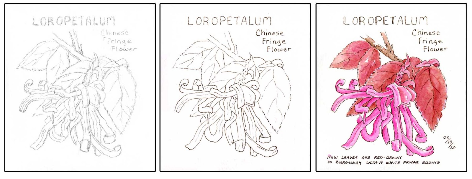
Today was another beautiful sunny day. Early afternoon it was 80 when I spent a little time outside with a nice slight breeze. These evergreen shrubs line the front of our house and are springing to life with new growth as well as flowers blooming.
Beautiful shrub even without the flowers due to the contrasting reddish/brown to burgundy new leaf growth against the older green leaves. Leaves have a white fringe like edging and the flowers are little bundles of ribbon like petals.
Until today, we had no idea what shrubs these were. After doing some research, we learned they are Loropetalum....also called Chinese Fringe Flowers. They are in the family of Witchhazel and cold hardy in zones 7-10.
5.5 x 6 journal with Arches watercolor paper / Metropolitan with #41 Brown / W&N and DS watercolors. Pink is Opera and the mix I used for the leaves was W&N Light Red mixed with DS Quin Rose.
Beautiful shrub even without the flowers due to the contrasting reddish/brown to burgundy new leaf growth against the older green leaves. Leaves have a white fringe like edging and the flowers are little bundles of ribbon like petals.
Until today, we had no idea what shrubs these were. After doing some research, we learned they are Loropetalum....also called Chinese Fringe Flowers. They are in the family of Witchhazel and cold hardy in zones 7-10.
5.5 x 6 journal with Arches watercolor paper / Metropolitan with #41 Brown / W&N and DS watercolors. Pink is Opera and the mix I used for the leaves was W&N Light Red mixed with DS Quin Rose.
Saturday, March 14, 2020
Escaping the Panic and Hysteria
Today is a beautiful sunny day with temperatures in low 80s. Flowers are in full bloom, birds singing and chattering, sounds of lawnmowers and neighbors firing up their bikes that have sat unused during the winter months, people out walking their dogs or walking with their children enjoying the weather, etc.
These are the things I choose to focus on for peace of mind right now.
Outside my window the Azalea shrubs are in full bloom. We have red and white or almost white with a pale pink tint to them. Although they produce a flower or two starting in January, they really display their beauty late February and March.
I started this yesterday and added color this morning.
Journal with Fabriano Hotpress watercolor paper / Lamy w/Document Brown ink / Various brands of watercolor on my palettes.
These are the things I choose to focus on for peace of mind right now.
Outside my window the Azalea shrubs are in full bloom. We have red and white or almost white with a pale pink tint to them. Although they produce a flower or two starting in January, they really display their beauty late February and March.
I started this yesterday and added color this morning.
Journal with Fabriano Hotpress watercolor paper / Lamy w/Document Brown ink / Various brands of watercolor on my palettes.
Thursday, March 12, 2020
Where Do You Like to Sit and Create When at Home?
It used to be I spent all my time in one dedicated location.............the sunroom. That's back when we had eight people, 5 dogs, and 2 cats all under one roof...a moderate 3 bedroom house. The large long dining room was split into two rooms partitioned off with cabinets with son and wife on one side and my two granddaughters on the other. My other two sons shared a room plus Terry and I had our rooms. It was quite cozy to say the least.
I had art supplies on shelves back in a walk in closet and my office/craft room out in the enclosed sunroom.
When the kiddos were able to get their own places, we had all this space and was able to spread out. I moved my "office" up to the front in the room considered the dining room with the other half as a small living room. I was able to bring out the shelves from the closet and place in the sunroom along with another table. Nice set-up but I tend to stay up front even to sketch and paint.
I love sitting at the window that looks out front....much more to see than sitting in the sunroom looking out the back that is fenced in. I found a foyer table just big enough to work on and I find more and more of my daily used art supplies finding their way up with me :-) I can watch the birds, work on the computer and watch TV without having to move to a separate room. Plus I have a special chair up front I found I can sit in without agitating the nerve issues I deal with in my legs.
My husband teases me and tells everyone I've taken up 2/3rds of the house (which is probably right........ha ha).
Sunroom that I have access to from the bedroom and what we use as a dining room now.
Office area up front:
Even when the curtains are drawn at night, I tend to work on this little table rather than the larger one on the other side of where I sit. I have better lighting with a corner light than I do with the overhead light.
The other place I'll sit and work in my journal is sitting back in a rocker / recliner in bedroom with a lapboard. I normally just use pencil or do the ink line work but I don't mess with watercolor unless in the other two locations mentioned above.
AND.......once in a blue moon, I'll sit out back on the patio and sketch with pencil. I don't too often because I don't take the Florida heat and humidity well.
I always love seeing what other people do.........how they work and their set-ups.
I had art supplies on shelves back in a walk in closet and my office/craft room out in the enclosed sunroom.
When the kiddos were able to get their own places, we had all this space and was able to spread out. I moved my "office" up to the front in the room considered the dining room with the other half as a small living room. I was able to bring out the shelves from the closet and place in the sunroom along with another table. Nice set-up but I tend to stay up front even to sketch and paint.
I love sitting at the window that looks out front....much more to see than sitting in the sunroom looking out the back that is fenced in. I found a foyer table just big enough to work on and I find more and more of my daily used art supplies finding their way up with me :-) I can watch the birds, work on the computer and watch TV without having to move to a separate room. Plus I have a special chair up front I found I can sit in without agitating the nerve issues I deal with in my legs.
My husband teases me and tells everyone I've taken up 2/3rds of the house (which is probably right........ha ha).
Sunroom that I have access to from the bedroom and what we use as a dining room now.
Office area up front:
Part of the view out front:
The other place I'll sit and work in my journal is sitting back in a rocker / recliner in bedroom with a lapboard. I normally just use pencil or do the ink line work but I don't mess with watercolor unless in the other two locations mentioned above.
AND.......once in a blue moon, I'll sit out back on the patio and sketch with pencil. I don't too often because I don't take the Florida heat and humidity well.
I always love seeing what other people do.........how they work and their set-ups.
Saturday, March 7, 2020
Cardinal Outside My Window - Moment Sketchers for March
It's only been recent that I learned about a group called Moment Sketchers through Instagram. They may also be on Facebook but it was a group suggested to me by a friend to check out who's on Instagram.

Each first full weekend of the month, people all over the globe are invited to join in sketching anything they want. The idea is to sketch the same weekend as a group and hashtag if they wish to.
This is what I did for this weekend........this cardinal sitting on the bend of a pole we hang our hummer feeder on..........hidden on the backside of the shrub that faces the window I sit at. He may have been there to get out of the wind for all I know as he just sat there for a long time. It's been rather windy today with some nice gusts.
I could have added more foliage but wanted to keep it rather simple. Watercolor first and then applied the line-work. I probably should have done the line-work first so that the ink didn't go down as heavily as it tends to do over watercolor.
Small journal made with Arches 140 lb Coldpress / Lamy pens - Dark Green and Document Brown / DS and OoR watercolors.

Each first full weekend of the month, people all over the globe are invited to join in sketching anything they want. The idea is to sketch the same weekend as a group and hashtag if they wish to.
This is what I did for this weekend........this cardinal sitting on the bend of a pole we hang our hummer feeder on..........hidden on the backside of the shrub that faces the window I sit at. He may have been there to get out of the wind for all I know as he just sat there for a long time. It's been rather windy today with some nice gusts.
I could have added more foliage but wanted to keep it rather simple. Watercolor first and then applied the line-work. I probably should have done the line-work first so that the ink didn't go down as heavily as it tends to do over watercolor.
Small journal made with Arches 140 lb Coldpress / Lamy pens - Dark Green and Document Brown / DS and OoR watercolors.
Wednesday, March 4, 2020
White Ibis Visiting Our Yard
We see these guys often in the subdivision but not always in our yard. We had a nice flock stop by for a little while. Even when a couple young boys rode by on their bicycles, they stayed but moved a little closer to the house away from the edge of the road.This represents flying in, coming in for a landing, and walking/standing around. No juveniles in this bunch, which are brown and black in the body until they mature.
Weather 84 (F) / partly cloudy / breezy. Earlier we had fog.
Journal w/Fabriano Hotpress / Sharpie pen / DS watercolors
Saturday, February 29, 2020
Photographed versus Scanned
Yesterday I worked on a watercolor sketch of my Golden Pothos plant. As I worked, I took a few photographs over a two hour period as I leisurely worked this sketch. Out of curiosity, I also scanned as I wanted to compare between camera and scanner with colors and tones.
My scanner tends to "enhance" making the results a bit more vibrant with more contrast. It doesn't pick up subtle changes in color variation nor does it do a great job picking up certain blues and yellows. The scanner also does poorly with natural colors of paper like Arches versus bright white papers often appearing blotchy.
I never felt comfortable using a camera for my artwork because of white balance/color cast due to lighting but at least the camera lens picks up what the scanner does not.
In either case, I'm always having to try and fine tune in Photoshop Elements attempting to match actual tones and colors that I see in my journals. The worst fine tuning when dealing with photographs being the need to remove the color cast or where part of an image might be brighter than another area.
Using Camera:
For the photographs, I used my Samsung Note 8 camera. The first two photos were taken within a thirty minute to an hour time frame so not much change in lighting from the window I was sitting at. By the third photograph, the lighting was definitely different creating a bluish color cast I definitely had to try and fix. In doing so, I lost part of the pencil line work of the plastic shelf unit the plant sits on. All three I had to lighten a bit. I really do not enjoy dealing with white balance issues. Maybe if I understood it better and how to avoid in the first place, it wouldn't be so bad.
Although working to remove color cast, the first two still have a yellowish to gray tone whereas the final photograph still shows a slight blue in the white of the paper. At least the green colors picked up by the camera lens are closer to the actual colors and variations in the watercolor sketch.
Using the Scanner:
I scanned twice making adjustments in the scanner's software. Neither could pick up the green variations the camera lens on my phone picked up.
Left: Auto correction in software at 24 Bit and 300 resolution
Right: Turned off Auto setting and changed to 48 Bit and 300 resolution
What the difference is between 24 and 48 in how it affects colors, etc. is beyond me. Something I'll have to do some research on.
In comparison, turning off the auto correction picked up more of the blues that actual leaves have however still did not render correctly all the green variations in the sketch. Both scans picked up more of the green making the results more lively than in the photographs.
The actual colors and tones on the page in my journal would fall somewhere between the final photograph above and the right scan below.......leaning more towards the photograph.
My final thoughts:
I still prefer to scan since I often use my art images for making magnets, note cards, and other craft projects. Scans are cleaner for printing. Normally the only adjustment I have to make in Photoshop Elements is in the brightness/contrast controls. The lighting with scanning is constant. Just wish the scanner picked up the subtle variations in color that a camera lens can pick up. For printing, I wouldn't want the texture of the paper to show.
As for the photographs.............even if I used my good DSLR, it makes no difference when dealing with white balance. It might if I knew how to properly set the camera for different lighting situations that constantly change or had a better artificial lighting setup when taking photos of my artwork. I do like that the camera can pick up the color variations the scanner does not plus it's ability to pick up the texture of the paper for times I might wish for it to show.......whereas the scanner does not.
My scanner tends to "enhance" making the results a bit more vibrant with more contrast. It doesn't pick up subtle changes in color variation nor does it do a great job picking up certain blues and yellows. The scanner also does poorly with natural colors of paper like Arches versus bright white papers often appearing blotchy.
I never felt comfortable using a camera for my artwork because of white balance/color cast due to lighting but at least the camera lens picks up what the scanner does not.
In either case, I'm always having to try and fine tune in Photoshop Elements attempting to match actual tones and colors that I see in my journals. The worst fine tuning when dealing with photographs being the need to remove the color cast or where part of an image might be brighter than another area.
Using Camera:
For the photographs, I used my Samsung Note 8 camera. The first two photos were taken within a thirty minute to an hour time frame so not much change in lighting from the window I was sitting at. By the third photograph, the lighting was definitely different creating a bluish color cast I definitely had to try and fix. In doing so, I lost part of the pencil line work of the plastic shelf unit the plant sits on. All three I had to lighten a bit. I really do not enjoy dealing with white balance issues. Maybe if I understood it better and how to avoid in the first place, it wouldn't be so bad.
Although working to remove color cast, the first two still have a yellowish to gray tone whereas the final photograph still shows a slight blue in the white of the paper. At least the green colors picked up by the camera lens are closer to the actual colors and variations in the watercolor sketch.
Using the Scanner:
I scanned twice making adjustments in the scanner's software. Neither could pick up the green variations the camera lens on my phone picked up.
Left: Auto correction in software at 24 Bit and 300 resolution
Right: Turned off Auto setting and changed to 48 Bit and 300 resolution
What the difference is between 24 and 48 in how it affects colors, etc. is beyond me. Something I'll have to do some research on.
In comparison, turning off the auto correction picked up more of the blues that actual leaves have however still did not render correctly all the green variations in the sketch. Both scans picked up more of the green making the results more lively than in the photographs.
The actual colors and tones on the page in my journal would fall somewhere between the final photograph above and the right scan below.......leaning more towards the photograph.
My final thoughts:
I still prefer to scan since I often use my art images for making magnets, note cards, and other craft projects. Scans are cleaner for printing. Normally the only adjustment I have to make in Photoshop Elements is in the brightness/contrast controls. The lighting with scanning is constant. Just wish the scanner picked up the subtle variations in color that a camera lens can pick up. For printing, I wouldn't want the texture of the paper to show.
As for the photographs.............even if I used my good DSLR, it makes no difference when dealing with white balance. It might if I knew how to properly set the camera for different lighting situations that constantly change or had a better artificial lighting setup when taking photos of my artwork. I do like that the camera can pick up the color variations the scanner does not plus it's ability to pick up the texture of the paper for times I might wish for it to show.......whereas the scanner does not.
Friday, February 28, 2020
Heart Warming and Sweet
I couldn't pass up working this one in my journal. These are my favorite cousin's grandchildren from her two daughters. The young man in the middle was diagnosed with Leukemia as a toddler, while at the same time my cousin was diagnosed with stage 4 breast cancer. Both faced extremely low odds of surviving; however, both beat those odds against them. The Leukemia survivor is now around 10 or 11 years old 😀💖
Journal w/Fabriano Hotpress / Lamy w/Document Brown ink / DS watercolors
Tuesday, February 25, 2020
Still Hanging On
One more for today..........our Chinese Flame tree, which is a cousin of the Golden Rain tree. It's the only almost bare tree we have in our yard. What stands out to me are the stubborn leaves and a few seed pods still hanging on. Even after the high winds we had over the last weekend, they refuse to drop.
All the remaining trees on our property are evergreen or are not affected by the colder temperatures we MIGHT have during the winter. In fact as I look down the road in all directions from my window, there are very few trees looking like this one.
Fabriano Hot Press / Lamy w/Doc Brown ink / DS watercolors
Trying to Stay Warm
Over the weekend our temperatures dropped 30 degrees over night. Florida winters are crazy with it being in the 80s for a few days and than drop to the 50s or 60s daytime temps. There was a cold front that moved in bringing gusty winds and cold temperatures. Yesterday and today daytime temps being low 80s but then we will get another round of cold over the next several days with daytime temps in 60s and night time temps dropping into high 30s and low 40s. Nice sleeping weather :-)One of the things I noticed were the doves sitting in our flat feeders......not eating, but instead just sitting with necks tucked close to body as they tried to stay warm. You'd think they would sit in a tree instead surrounded by leaves rather than exposed to the wind out in the open.
5.5x6 journal with Arches / Lamy with Doc Brown ink / DS watercolors
Monday, February 24, 2020
Loquat Fruit - Stage as of Feb 24th
It's a beautiful sunny morning with temperatures low 60s. Took notice of how loaded our Loquat tree is with fruit this year. A few had already ripened but quickly disappeared from what we suspect are birds feasting as the fruit turns orange/yellow.I've yet to try one that wasn't tart but a lot depends on the variety from what I've read. Some varieties are sweeter than others. Might be I'm still unsure when they are at their best/ripe stage. And I might be pleasantly surprised should I get it right in trying one this time and not be so tart.
Our neighbors love these for making jam :-)
FIbook75x75 / Stonehenge Aqua / Metropolitan pen with Noodlers #41 Brown / DS watercolors
Sunday, February 23, 2020
Lemon Buds and Flowers
After six years living in Florida, it still amazes me the number of various plants and shrubs budding and flowering this time of year.
Spent some time outside enjoying the cool weather (60 plus degrees) soaking in the sun. I walked around looking at all the flowers going strong here in February. We still have oranges and lemons hanging from the trees with new buds and flowers already forming. Terry spent the day yesterday clearing off the fruit so that the trees' energy could concentrate on the new growth. We have three lemon trees and two orange trees and they are such prolific fruit producers that we and our neighbors can only make a dent in what's out there.
This is from the Lemon tree in our back yard.
Journal with Arches watercolor paper / DS watercolors / Metropolitan with #41 Brown.
I actually mixed my greens with Phthalo Blue (RS) and New Gamboge. I still prefer just using a tube green adding other colors to it but decided to do something a little different. Where so many artists like the variation with blues and yellows taking precedence in different areas of the green, I prefer working with a more predictable green base. But that's just me :-)
Watercolor first and then the line work with pen and ink
Spent some time outside enjoying the cool weather (60 plus degrees) soaking in the sun. I walked around looking at all the flowers going strong here in February. We still have oranges and lemons hanging from the trees with new buds and flowers already forming. Terry spent the day yesterday clearing off the fruit so that the trees' energy could concentrate on the new growth. We have three lemon trees and two orange trees and they are such prolific fruit producers that we and our neighbors can only make a dent in what's out there.
This is from the Lemon tree in our back yard.
Journal with Arches watercolor paper / DS watercolors / Metropolitan with #41 Brown.
I actually mixed my greens with Phthalo Blue (RS) and New Gamboge. I still prefer just using a tube green adding other colors to it but decided to do something a little different. Where so many artists like the variation with blues and yellows taking precedence in different areas of the green, I prefer working with a more predictable green base. But that's just me :-)
Watercolor first and then the line work with pen and ink
Saturday, February 22, 2020
Unknown Shrub
As I'm playing with various mediums on different papers, I was looking out my window at this shrub with these little clusters of white flowers. What really captured my attention was the fact some have greenish-white stamens whereas others have red.The flowers are primarily growing on top and in the front where they get the most sunlight. The side facing me is bare of flowers.
Wish I could identify this shrub but internet search has not been real successful.
Saunders 90 lb watercolor paper / DS watercolors / Albrecht Durer watercolor pencils / Lamy pen
Added image of the actual shrub........
Subscribe to:
Posts (Atom)