

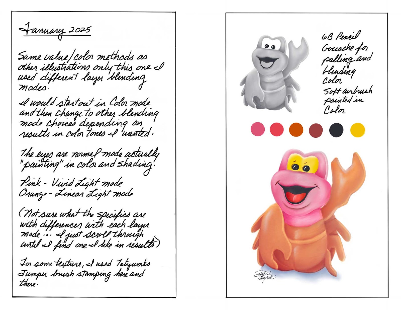
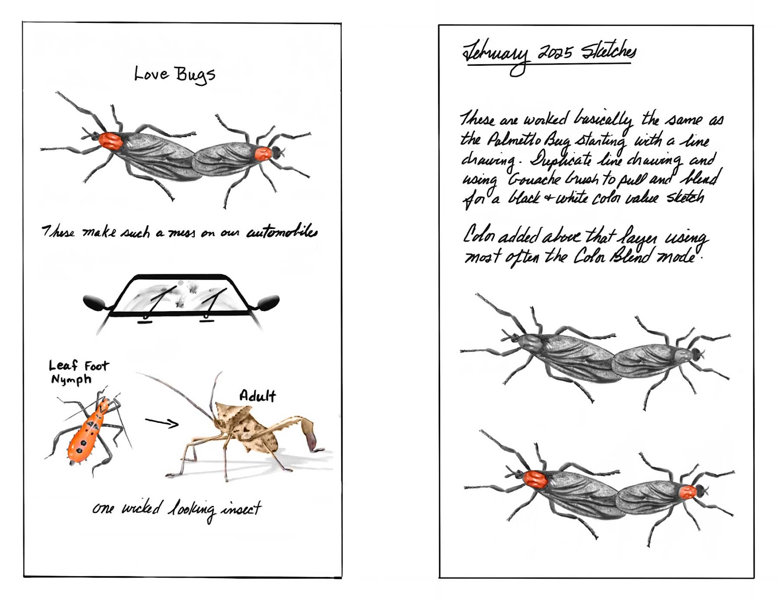
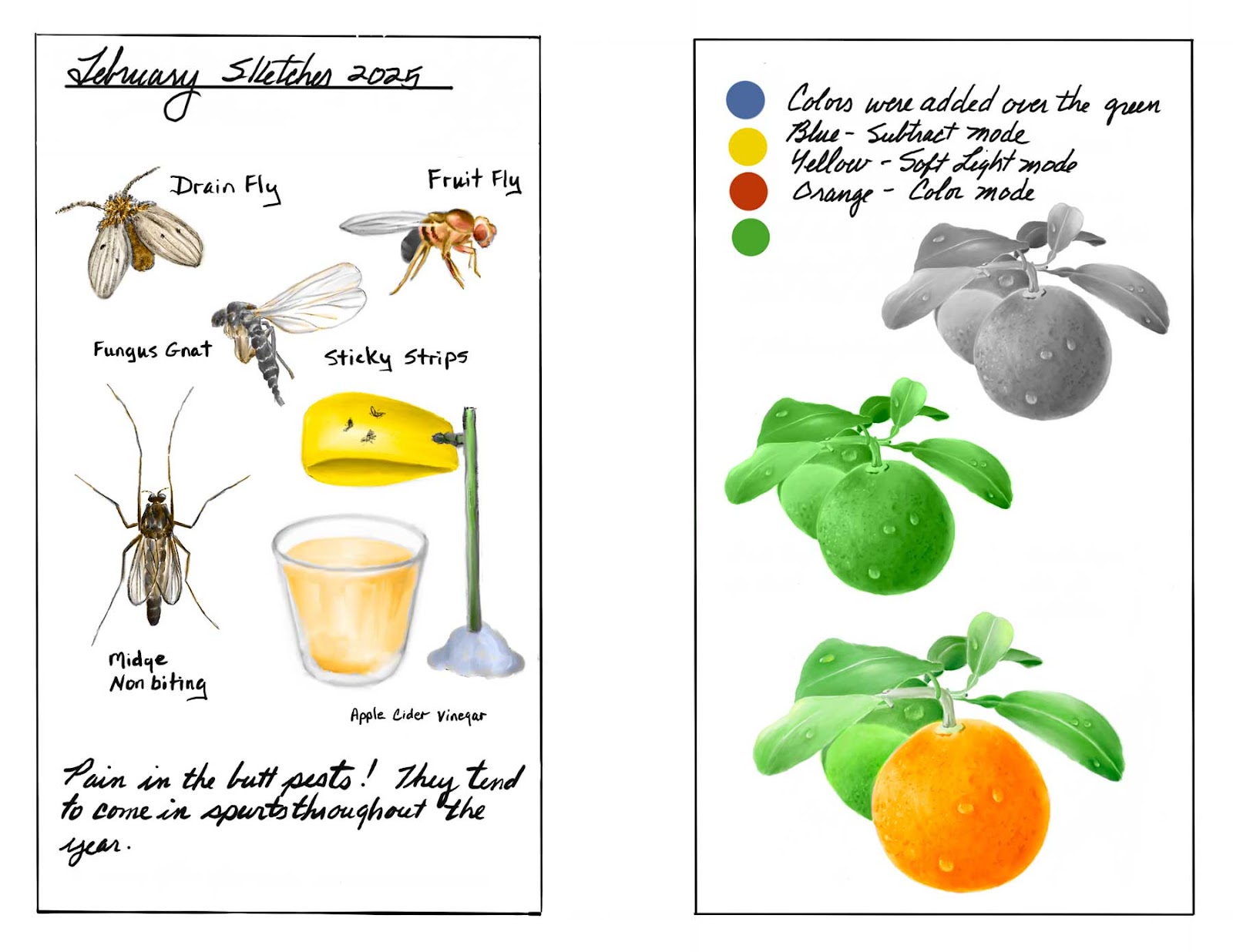
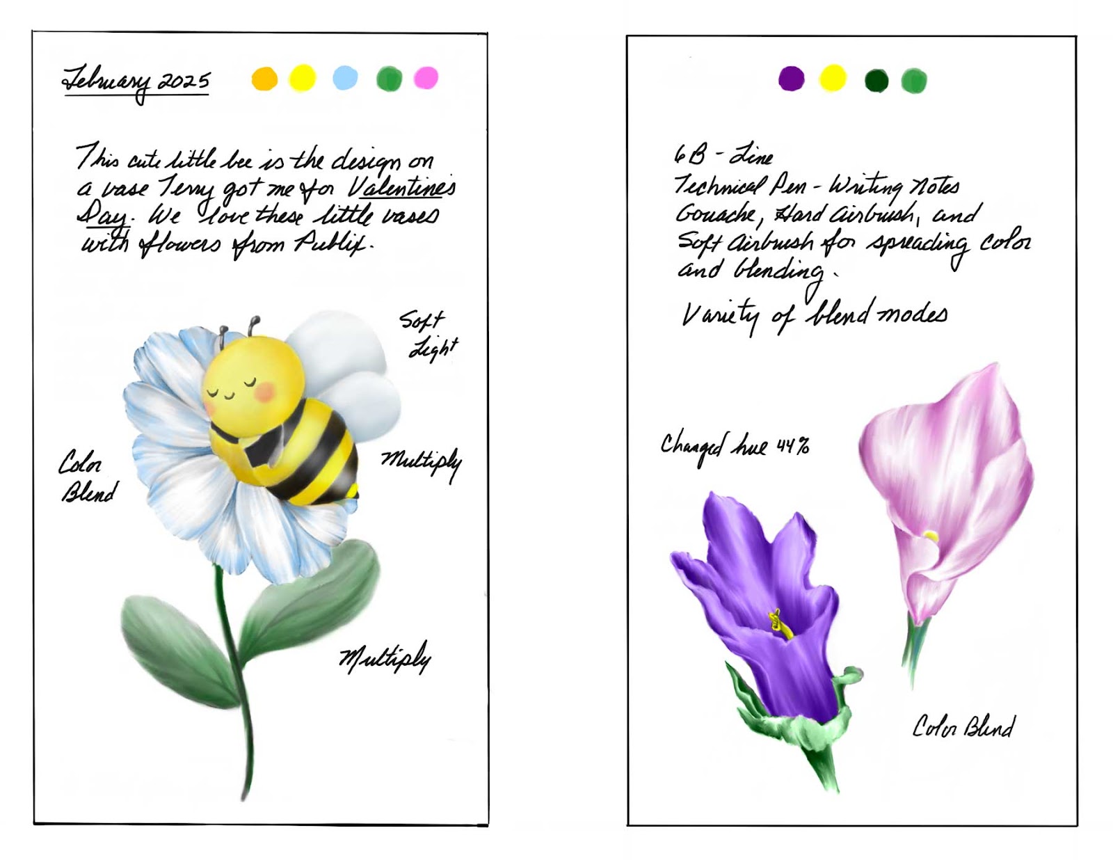
Sunday, January 11, 2026
January 2026 Drawing - Paige's Cat, Tiger
This was done at the request of my lovely daughter-in-law, Paige. Worked using Procreate on the ipad. With this one I used a different brush than I'm used to using called the MWC Bristle Flat Original. Palette of four colors used.
November and December 2025 Sketches, Studies, and Drawings
It's been awhile and I decided to do a little sketching in a new sketchbook gifted to me by Aarti. Being so used to doing this on the ipad, I kept wanting to hit the undo button from time to time that doesn't exist.....lol.


And back to sketching and drawing on the ipad:


Wednesday, October 29, 2025
Inspiration from Birthday Flowers
I've been on a roll with drawing after the flowers the guys sent me for my birthday. Although I've worked on a few other things besides flowers (not shown in this post), it was those arrangements that inspired and motivated me.
The last drawing in this post is a banana plant that has come back up in our back yard.


Thursday, October 16, 2025
Roses for my Birthday
This year, I received two beautiful bouquets of flowers for my birthday. A great incentive for me to draw. To start out, I decided to focus on the roses in one of the flower arrangements.

Although I'm calling this basically finished, there are various things I could improve on. One being the lighting. Unfortunately, I work with what I have with the normal lighting in my house without "staging" for lighting effects. Not showing here, I am still playing with backgrounds of different methods and colors.
As I was working on this, I considered adding other flowers as fillers around the roses (like what are in the arrangements) but chose not to.
Last count on number of layers is 55 but that also includes screenshots of the stages for sharing the steps like this as well as multiple layers for each component with base colors, lights, and darks, etc. Anymore, I also add layers for notes so I can remember just what I did throughout. Before I would keep notes on paper and then misplace them. When I was blogging on a regular basis, I would use my blog describing everything to remind me but then this year I haven't been real on top of things.
Last count on number of layers is 55 but that also includes screenshots of the stages for sharing the steps like this as well as multiple layers for each component with base colors, lights, and darks, etc. Anymore, I also add layers for notes so I can remember just what I did throughout. Before I would keep notes on paper and then misplace them. When I was blogging on a regular basis, I would use my blog describing everything to remind me but then this year I haven't been real on top of things.
Monday, October 13, 2025
OK, Where Did the Time Go?
This year has flown by and I can't believe how little I've done this year with regards to drawing (or painting as some might call it). Basically, I have been extremely lax (or lazy) not only in producing anything art related but keeping up with my blog. Maybe, I just needed a long "recharge" period. The jury is still out on that one.


Another example using the Selection tool and then filling in color with a brush.

A Switch game the family has been playing for weeks is Fantasy Life: The Girl Who Steals Time. We've been playing multiplayer and my son's character he customized is one of my favorites. It fits him......haha. And since this drawing, two more family members have started playing, so now there are six of us.


Outside of the little bit of drawing done this year, I have worked on creating two printed digital journals. One for last year's accomplishments and then I created one with my favorite subjects which consist of my miniature bear collection and other plush toys (to include dog toys).
Once I finish printing, I plan to spiral bind these together.


And this brings me up to date.
My only blog post so far for 2025 was made in July and that was catching up sharing results to date without much in the way of information to go along with what I had done. And here I am again doing the same thing trying to catch up.
I'm finally getting back out and involved with my art so hopefully I will do better in the coming months.
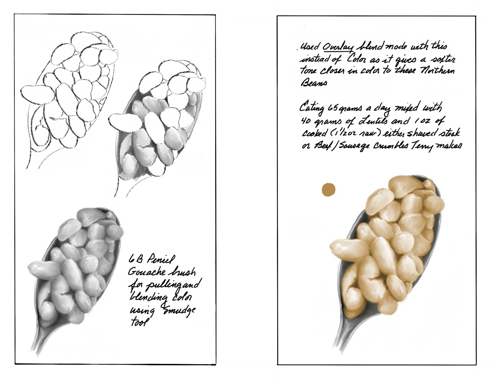
This is from a plant poke gifted to me completed towards the end of July.
In August, I decided to step outside my comfort zone and play with various brushes I have that I wouldn't normally think about using. I found I enjoyed the challenge and liked some of the results I achieved.
The method used to work these brushes is as follows. The one thing I failed to mention on the sheet was the fact the color applied was using the Color blend mode over the value sketch layers.
Another example using the Selection tool and then filling in color with a brush.
My latest has been playing with two new brushes that came out in the Procreate 5.4 update.
A little demo I put together for my granddaughter showing how I'm using the Selection tool for adding color. No presketch.
Once I finish printing, I plan to spiral bind these together.
And this brings me up to date.
Monday, July 14, 2025
2025 Sketches/Drawings to Date
Bringing things up to date since my last post.
The following includes some digital journaling along with a few portraits.
The bird drawing is of a Painted Bunting seen outside our living room window.
Portraits include my nephew's daughter, self portrait, sister-in-law, and a 6 month old Maine Coon kitten my youngest son and daughter-in-law have.
All worked using iPad and Procreate.


Subscribe to:
Posts (Atom)