Back in May 2019, I started a 30 day "Draw Your Day" regimen that I really like. The only drawback I found was the daily design/layout thought process on top of what to choose to sketch for the day. Not every day do I feel up to the thought process of design. This is one of the main reasons I typically draw one illustration to a page with some writing I might add....less taxing on the brain.
Because I've not been too inspired to work in physical sketchbooks/journals with pen and ink plus watercolor, I thought I would play a bit doing the same thing but on the Ipad. Each "file" being a page I can later print out if I choose.
The size of each page is about half of a letter size piece of paper (horizontal orientation) plus allocated space should I bind the pages together instead of creating signatures and hand sewing. (Still working out the specifics in canvas size to fit to print depending on which way I choose to go....spiral or hand sewn.)
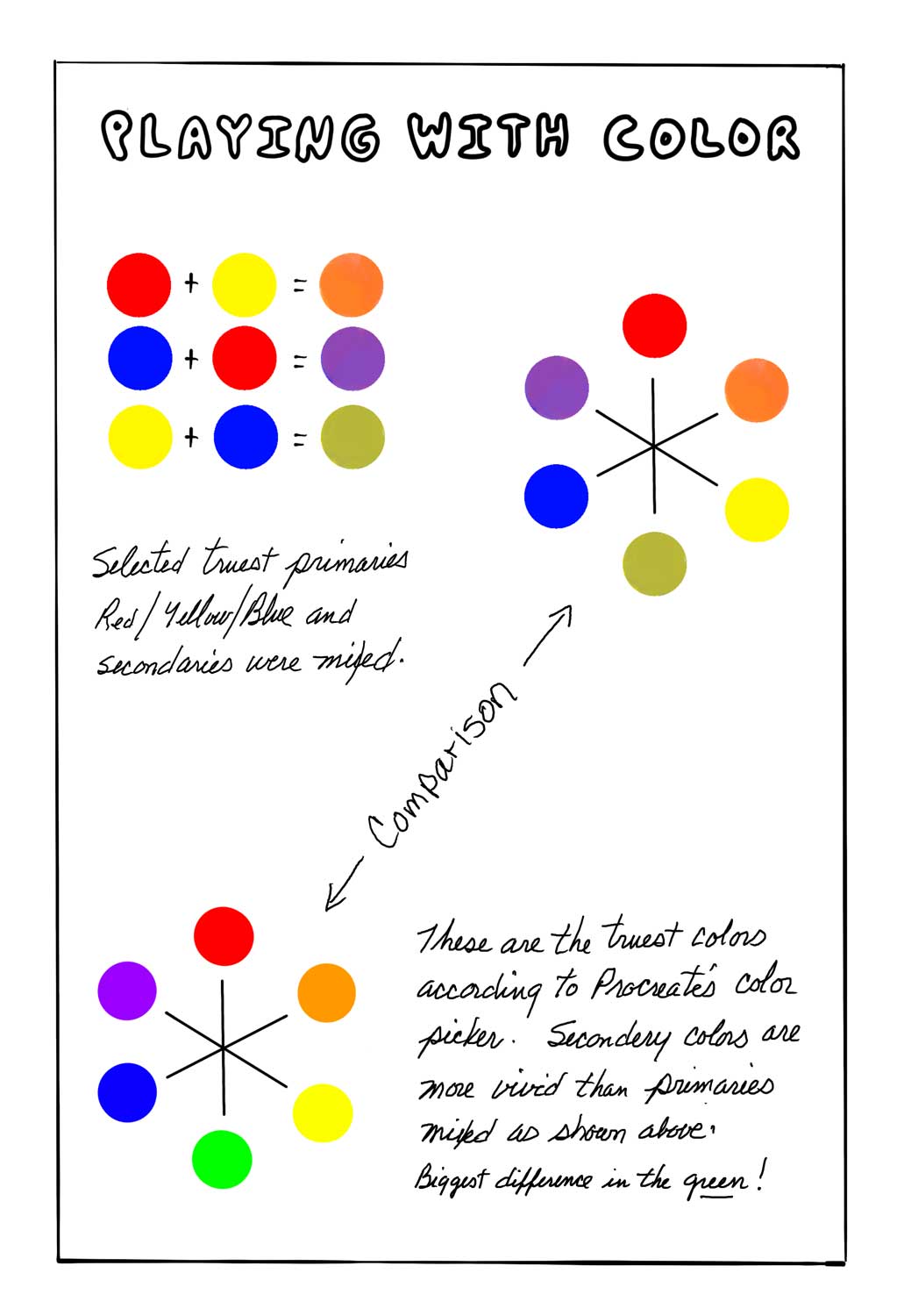
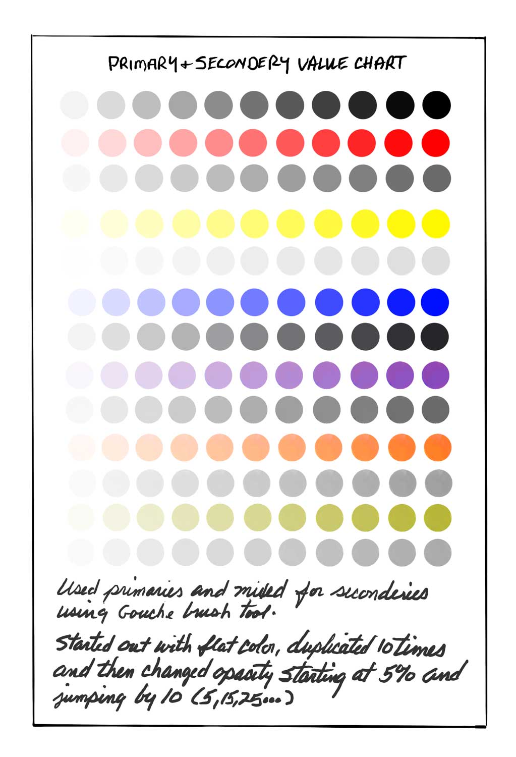
Starting the digital journal, I wanted to play with primaries/secondaries along with color values. First experiment was taking Procreate's version of true primary colors (red, blue, yellow) and actually blending together to get my secondaries. Turned out a bit different when compared to the app's version of true secondaries (green, purple, orange).....especially in the green.
The orange and purple came close but a tad more vivid. I don't care for the app's version of true green at all. Way to bright in hue. But the mixed version is a bit too muted for my liking as well and I tried mixing a few times coming out with basically the same result. Again, this was just an experiment for fun.


Next I wanted to create some icons as reference I might want to use either by copying and pasting or just reference to re-sketch each time. I played with colors to denote mood and facial features I might want to use that describe my day in general. Also worked on weather icons. Two other illustration icons I consider including on a page may be my progress with diet and my sleep patterns. Will just depend, taking it day by day.
The next three are actual page examples putting some of the above together along with sketches for that day. The "Doodles" page is just starting with a shape with nothing in mind and going from there. I tend to create creatures out of shapes like bugs and other critters and have no idea why. Just like I have no idea why I chose to have a spider holding a piece of mail. It was fun even if it's "out there" with content.


No comments:
Post a Comment