Thursday, December 6, 2012

Rudie Wood Carving Sketch

Rudie is made of wood (no cloth on him.......all carved to look like clothing); and has LED lights as well as the fiber optic lights.  I decided to do a graphite sketch of him using a bit of artistic license not including lights or the skies he was holding.  Instead he's holding cinnamon sticks :-))

I really had trouble with the scarf and even the hat.  Trying to make them both look like cloth but I struggled with the folds.  My brain was saying it should look one way when the wood carving of these said something totally different.  So I was a bit lost when trying to put down on paper.

Stillman & Birn Alpha series sketchbook
Pilot Prera with Lexington Gray ink (used in a few areas just to give a little extra dark)
Derwent 9B graphite pencil


Wednesday, December 5, 2012

Pen and Ink Sketches

Back in October, my two granddaughters presented me with some art goodies for my birthday.  One of the gifts was a large spiral sketchbook picked up at one of the local stores.

The paper is definitely not artist grade paper and a bit of a challenge to work in......however, I'm enjoying the challenge.  Plus.... each week when the girls come to stay with me in the afternoons, they check to see if I have started using their gifts.  I had to do something as I sure didn't want to hurt their feelings even with the multiple sketchbooks I have currently going.

One of the pluses I'm finding to this paper is the fact my pen skips across the surface allowing for super light / fine lines as I work the illustrations with ink only.  I can slowly build up the tones by going over the areas several times.  It's definitely easier to build up than it is to take away ink ;-)

The negative is the pen nib picks up paper dust and I have to wipe it now and then.  Not too big of a deal though and happens mostly with the Pilot Prera than it does with the Noodler's Flex pen.

I may dedicate this sketchbook to pen and ink only.


Another Christmas Card Idea

Still thinking about the granddaughters playing with Christmas  card ideas they might like.

Epsilon series Stillman and Birn sketchbook

Pilot Prera with Lexington Gray ink

W&N pigments - Winsor Blue (Red), Lemon Yellow, Cobalt Blue, Opera Pink, Bt Umber, Bt Sienna, Raw Sienna, and Perm Aliz.

I wrote the "Merry Christmas" with an Elegant Writer calligraphy pen but if I print off cards, I'll probably use Photoshop and a selected font to add the greeting portion of the card.

Saturday, December 1, 2012

Mini Christmas Tree

This one is a combination of pen and ink finished off with three different pencils.......HB, 4B, and 9B

Stillman & Birn Epsilon sketchbook


Wednesday, November 28, 2012

Rendering the Hand in Graphite

From simple contour sketching to shading ..........

Using a mechanical pencil, I first sketched a simple contour shape of my hand.  Then I took a paper stump and pulled the graphite shading giving form.  If I needed to go darker, I scribbled graphite on a separate piece of paper rubbing the paper stump in it and then back to the hand.  Or you can go back over gently with the pencil lead itself and then blending it out with the paper stump.  I worked these both ways until I achieved the look I was hoping for.

Side Note:  Have a putty eraser handy as it can be used not only for erasing areas you don't care for but as a great "tool" for adding highlights. 

Also sometimes I might want a nice evenly shaded area but might end up with a spot or two that's darker than the rest.............take your putty eraser and shape one end about the size of the area that's too dark and then just lightly touch eraser over the spot.  Many times it will lift just enough to make that spot blend in with the rest of the shading without messing up the tone you want (that's surrounding the dark blotch). If need be, gently "dab" the area again.

Done on cartridge paper:


Went with less lines for wrinkles on this next one........


Worked the finger and thumb in the same way. 


Practicing Snow and Trees

Painting snow USED to come fairly easy for me but I'm definitely feeling a bit rusty now.  I've decided I need to return to some basics again to especially include composition. 

Here are two pages where I'm just messing around practicing. 


Both pages in the Stillman & Birn Alpha series sketchbooks using W&N pigments.  Winsor Blue (Red), Fr Ultra, Indigo, Raw Sienna, and Bt Sienna.

#8 Round,  #4 Round, 1/2" flat, 3/8" Angular Flat (trying various ways to make the trees)

Not looking at anything but instead just using some imagination as I put down paint.


Saturday, November 24, 2012

Disjointed

Something a bit different.........

Stillman & Birn Alpha

#8 Round

Winsor & Newton:  Winsor Blue (Red), Winsor Lemon, Raw Sienna, Bt Sienna, and Perm Aliz

Left is the page I painted and the right using PS Elements to put the pieces together.


Friday, November 23, 2012

My Bunny Buddy

Here's a sketch I did tonight ................

Derwent HB in Stillman & Birn Alpha sketchbook

I really like the vellum surface for graphite work!

Started out using the side of the pencil lead for a roughed in sketch outline and then defined once satisfied with the proportions. 

Thursday, November 22, 2012

Holiday Preparation Soon to Begin

Newest graphite sketch...............

Stillman & Birn Alpha series sketchbook

Derwent HB pencil

My granddaughters were playing with my little wooden manikin yesterday and my wanting to sketch something, I chose to sketch this guy in the pose they left him in.

As I was working the manikin, I wasn't sure what to do with him.  Somehow I wanted to make a complete scene but was lost at first in what that might be.

Then it came to me as I reached the legs what I could do..............make him look like he's standing behind a table so I lightly sketched that in.

Next I had to decide what to do with his arms and hands as they were positioned.  So not to have to erase what I'd already sketched ......... I decided on something like a rope might fit well.

Thanksgiving evening I normally pull out our Christmas tree so my thoughts were with my sketch as well as what I'd be doing this evening.  That's when the rest of the sketch came together.  Decided to add a hat that would denote the holiday season that begins tonight and then the tree that would go with what might pass as garland for the tree. 

The manikin to me looks like he's standing there holding the garland asking if the viewer thinks it will be long enough to put on the tree :-))

Side Note:   I didn't  put in legs or feet as I wasn't sure with the angle I put the table in how to do it without it looking funny.  I tried a few light sketches of feet and it was a no go............So he's bottomless.  The angle of the table is like I'm above looking down so honestly wonder if any of his legs or feet would show anyways.


Wednesday, November 21, 2012

Playing with Dolls

Tonight I was in the mood for some graphite sketching and decided to play with a doll :-))

Taking this plant poke doll made out of miniature pots, I worked these rough sketches using a Derwent 4B water soluble pencil (dry) in my Stillman and Birn Alpha sketchbook.

Using a bit of artistic license I decided to try a few different things like the doll on the left (as you view it) where I replaced the mini pot legs with one larger pot to look like a long dress.

At first I used a stump to smudge the shading/shadows but wasn't real happy with how it looked ......so I went back over using the side of my pencil lead. Here is the final results.

I started at top right working to the left and then the bottom.  The top right is a bit rough as I worked my first one.  Then the other two I felt a little more at ease with results being a bit more refined.


Christmas Card Possibility

Yesterday I worked on a Christmas card idea for my two granddaughters.  Trying to decide on what I might want to paint, I thumbed through the catalog I receive from the Artist's Club.  In the most recent issue were these wood ornaments with cute little critters that grabbed my eye.

Taking from several ornament examples .........this is what I came up with...the three cute figures together behind a package as if presenting it to the girls :-))


Another idea might be to take the illustration and place to the left on a landscape format card with written wishes to the right.  I'll have to play with that.

Watercolor sketch done in my Epsilon series sketchbook using W&N pigments.

.

Tuesday, November 20, 2012

My Main Fountain Pens

These are my four main fountain pens out of five I have on hand.

Didn't include the Noodler's Konrad as I'm not all that keen on it although it might come in handy for writing in general.  The nib is too thick for my liking with regards to sketching.

The Pilot Prera is definitely my favorite with the F nib.  One filled with a water soluble ink (Namiki Black) and the other with Lexington Gray.  This gray (to me) is a nice subtle dark gray I find works nicely with watercolor.  Not real stark where it stands out competing with the color later applied.

The Noodler's Flex (original) was my first fountain pen.  I enjoyed using it but didn't quite like the ink I put in..........too dark (Noodler's Black).  Once the cartridge is empty, I plan to fill it with either the Namiki Black or the Lexington Gray.  The nib is not as fine as the Prera......putting down thicker lines.

Now the Lamy I haven't done much with as of yet.  It has the original blue ink cartridge that came with the pen.  That too will be filled with another ink once the cart is empty.........just haven't decided which ink I'll use in it.

Winsor & Newton pigments used - Winsor Lemon, Winsor Blue (Red) (both Prera pens using these two pigments - one leaning more towards the yellow and the other more towards the blue), and Permanent Alizarin Crimson.  The lamy was done first with the water soluble ink washing it out and then going back over with some Paynes Gray.

#8 Round for all but the Lamy pen.  Used a 3/8" Angular Flat for the Lamy since I worked the ink into a wash and later applying some watercolor.

Stillman & Birn Epsilon series sketchbook


Along the Edge - Outside My Window

A little sketch of an area I see outside my window.  There are two scarecrows and this is the second I've sketched.  This resin rock formation used to be a fountain/pond until the pump died and we decided to convert it into a planter box. 

Early Spring we planted yellow pansies in the bottom.  Then another type annual I tried that didn't do all that great.  Can't remember the name of it and it was one I'd not tried to grow before.

This little set-up sits at the edge where the lawn meets the tree line of woods that surrounds us.

Stillman & Birn Epsilon series; Pilot Prera w/Lexington Gray ink; W&N paints - WB(R), RS, BS, BU, Fr Ultr, Paynes Gray, and Perm Aliz; #8 round.

Monday, November 19, 2012

Beach Treasures - Well Almost

Whenever we might happen by a beach, we spend our time looking for shells or sharks teeth (depending upon where we might happen to be).  Unfortunately, these type of shells I've illustrated aren't ones most can find along our beaches........instead you have to buy them.

Worked this a few days ago with a few shells purchased on our last trip to Texas.

Done in the Stillman & Birn Epsilon sketchbook using W&N pigments.....Winsor Blue (Red), Raw Sienna, Bt Sienna, Bt Umber, Perm Aliz

Pilot Prera with Lexington Gray ink


Danny Gregory's Newest Book - A Kiss Before You Go

 For all you Danny Gregory fans and potential future fans...............looks like this is going to be a g-o-o-d one (as are all his other books).


Wednesday, November 14, 2012

Chair in Graphite

Talk about a challenge for me!!  So much detail with all the chair components to have to try and capture.  I found myself getting lost and a bit frustrated but I did make myself follow through.

This was done with a Derwent 9B pencil mainly using side of the lead and then detailing more with the point.

Worked in the Stillman & Birn Epsilon sketchbook.

9B is very soft and one doesn't have to apply much pressure to get darks.  I was a bit timid thus keeping the entire sketch mostly light to medium tone.  Also, due to the ease in smudging, I will have to use a fixative on this page.


Monday, November 12, 2012

Graphite Sketch on Stillman & Birn Epsilon

Haven't done much the last day or so.  Did manage this little graphite sketch tonight in my Stillman & Birn Epsilon series sketchbook.

As shown on page, used my 0.5 mechanical pencil.


Saturday, November 10, 2012

Fabric Doll in Watercolor - Stillman & Birn Epsilon

While watching (actually listening) to TV tonight, I did this pen and ink with watercolor of a fabric broom doll I made years ago.  Done in the Stillman & Birn Epsilon sketchbook.

With this one I decided to push the limits on using watercolor.  Quite a pleasant surprise in how the paper handled my application of wet in wet.

Pilot Prera (F) with Lexington Gray ink

#8 Round

W&N pigments - Winsor Blue (R), Raw Sienna, Bt Sienna, Perm Aliz Crimson.

Green was mixed with WB(R) plus Bt Sienna

Looking at this on screen, if I were to do this again, I think I would incorporate some of the pink into the background to go with the dress.

Also, I would have liked for some pink bleed into the background along an edge or two of the dress but I didn't think of that at the time.  The background was put in well after the main subject was dry.  An after thought actually.

.

Friday, November 9, 2012

Doodling People

Just a little fun playing with brush and color in my Epsilon sketchbook. 

#8 Round with W&N pigments

Couple ink/wash figures with Prera and Namiki black ink.

**Some of the raw sienna limbs not showing up real well.  One lady looking like she's floating (grin)

Did these during a break vacuuming. 


Water Solube Ink and Stillman & Birn Epsilon Series

This is playing with water soluble ink with watercolor added after the ink wash has dried.

Stillman & Birn Epsilon sketchbook

Pilot Prera with Namiki black water soluble ink

#8 Round and 3/8" Angular Flat

There's just something intriguing about using water soluble ink and I love how it behaves on this paper.

These inks offer a challenge particularly when one goes to add a watercolor wash.  One has to take care in how much water is in the brush and how fluid the watercolor is when applying to inks that bleed..........to especially avoid total contamination or muddying of the watercolor.

What I find works best for me is pulling the ink first with damp brush and allowing that to dry.  What you will have is a black ink drawing with gray wash tones that have been pulled with the damp brush.  The washed out tones do not lift as easily mixing with the watercolor as untouched ink lines will.

And I often find an angular flat works well as it doesn't hold the amount of moisture a round does.  One feels in better control of the bleed spread.

Then using a fairly dry brush of watercolor carefully and gently lay down color so not to make untouched ink bleed and take over the color. 

One will undoubtedly come across an area of ink that had not been washed out that will bleed into the watercolor if the brush hits it.  The lighter the watercolor pigment, the more noticeable. 

The ink bleed can be used to one's advantage as it can create shadow and tone variation within the watercolor.  Just takes playing and practice to find what works best.  And, this technique doesn't always work out to my liking but now and then I get lucky with results I actually like.


Tuesday, November 6, 2012

Playing with Stillman & Birn Epsilon Series

Today I decided to open and try out my Epsilon sketchbook made by Stillman & Birn.

This paper is archival quality and heavy weight for Pen & Ink.  100 lb (150 gsm) natural white plate surface.

Definitely a different feel from the Alpha and the Beta.  As with any change,  I'm having to readjust or adapt to the paper so it will take me a little while before I feel comfortable saying too much other than what you might see with my initial notes on the pages.

Here are the results of the first few pages as I try two different inks plus a little watercolor:

1st Page - Pilot Prera with Lexington Gray permanent ink and light watercolor wash.


2nd Page - Pilot Prera with Namiki black water soluble ink and very slight watercolor swished here and there with damp brush.


3rd Page - Comparing both Preras with the two different inks.  Both Preras have the F nib.


4th Page - Quick sketch using the Prera and Namiki black ink trying to capture Miya looking up at me hoping I'd stop and play with her.  (Animals are not the easiest for me to render as I wish I could)


Sunday, November 4, 2012

Woodland Shrooms

This watercolor sketch is from imagination using a 3/4" daVinci flat.  Was a bit tricky considering the size page (5.5 x 8.5")  I was working on but I was determined.

And of course I never do things the easier way.........the mushrooms were painted first and then I had to work the background around them.  I just hate to use masking for one thing but the main reason is that I really didn't know where I was going with this.  I just worked the scene around the mushrooms.


This shows the two pages together in my Stillman & Birn Beta journal.  Although it wasn't planned as such, the two pages  together actually work out quite nicely.............guy hiking through the woods across rocky terrain and coming across the mushrooms on the forest floor (grin).


Thursday, November 1, 2012

Take a Hike

Thought I would take one of my 75 Day Challenge ink sketches from last year and paint a watercolor sketch .... along with a hiker to add a bit to the scene.

Completed in the Stillman & Birn Beta journal

Pilot Prera with Lexington Gray Ink

Daniel Smith pigments


Wednesday, October 31, 2012

Traveling Companion

Started this page day before the storm but didn't finish until today.  Was glued to the TV instead.

Page pretty much says it all.

Stillman & Birn Alpha

Pilot Prera with Lexington Gray

Daniel Smith pigments

#8 Round


Thursday, October 25, 2012

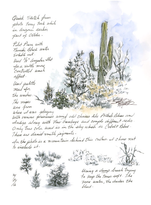
A little Piece of Arizona

Did this ink and wash with touch of watercolor the other day from a photo Terry took while in Arizona a few weeks ago. 

Stillman & Birn Alpha journal

Pilot Prera with Namiki Black water soluble ink

Daniel Smith - Cer Bl, Raw Sienna, and green mix that was on my palette from playing with different primary combinations (using up these mixes previously made)

3/8" Angular Flat for ink wash

#8 Round for added watercolor

Wednesday, October 24, 2012

Playing Again with Primaries

Cathy Johnson challenged her group in trying various primary triads that are different from their norm.  At least that was my understanding of the challenge.  Making color charts to show the various colors one can get from three pigments.  She also included Bt Sienna and either Paynes Gray or Indigo.  I chose Bt Umber as I don't much care for the Bt Sienna in the Daniel Smith line.  It's more like W&N Light Red and more opaque.

Rather than making a chart showing all the greens, oranges, and violets I could achieve, I decided I just wanted to try out the different triads painting the subject I love most............nature.

All pigments used are Daniel Smith


Notes and Thoughts about my Results:

With the first page I tried my two Phthalo Blues....one leaning towards Red and the other Green.

Although noted on the left page I wasn't crazy about the mix results, I could actually grow to like using both now and then for a change of pace.  As a rule, I do normally stay clear of most staining pigments.

The Phthalo Blue (G) for sure doesn't really look natural to me for foliage but might work out for background trees without the yellow top portion.  The pigment in itself is a lovely blue.  I may have to play some more mixing it with other yellow and red combinations just to compare.

At first I leaned towards favoring the mix using Indigo but seeing it side by side like this to the Phthalo Blue (R) mix, the PB(R) is actually livelier even if the blue tone might not be too natural looking (upon close examination).  There's a nice variation the one with Indigo doesn't quite have.  To me the Indigo mix  comes closest to looking natural but might become monotonous if used throughout a large passage in a painting.


Indigo is an interesting Blue and I use it a lot as a Black.  I love how back-runs look using this pigment especially in trees.  My favorite usage of this color is in winter scenes.

Bottom right is a little sample using Quin Bt Sienna as my Red.  It proved interesting to me..... nice variation.

Burnt Umber was used to mix with blues for the browns used in trunk and limbs.  Also splashed a bit of BU in ground and foliage.

Funny.........as I sit here posting my thoughts now compared to how I felt a couple days ago when I first did these pages, my thoughts and feelings waiver.  Not sure if one would call that being fickle or flexible :-)


Clifton Suspension Bridge Observatory

Yesterday I decided to once again go down memory lane by pulling up photos taken while visiting the United Kingdom in 2010.  A two week holiday Terry and I will never forget!!!

One of the places our friends took us was the Avon Gorge where we walked across the Clifton suspension bridge and on to the observatory. 

We had the added pleasure of  watching three rock climbers as they made their way up the cliffs.


A little bit of history shared by my friend Clare who we spent two weeks with............"For those unfamiliar with the area, the Observatory is on the top of the Avon Gorge, through which the River Avon flows under the Clifton Suspension Bridge, built by Isembard Kingdom Brunel. It was built for traders to save a very long journey between Abbots Leigh and Clifton, Bristol. The cliffs are several hundred feet high at this point and the Observatory is positioned with a wonderful view of the beautiful bridge."

This was done in my Stillman & Birn Alpha journal; using my Pilot Prera with the Namiki Black water soluble ink to get a subtle tone wash; and then applied watercolor using Daniel Smith pigments with a #8 Round.

A portion of the greens are from dried mixes where I was playing with various primary triads using either Indigo, Phthalo Blue (R) and (G) with Aureolin and Perm Aliz.  Plus Raw Sienna, Cer Blue (sky and rock), and a bit of Sap Green to add some emphasis to the trees around the one section of the observatory.


Tuesday, October 23, 2012

My More Recent Best Friends - Stillman & Birn and Pilot Prera

For weeks now I've been working in my new Stillman & Birn Beta and Alpha journals.  I have to say they are my favorite to work in compared to all other journals I've used in the past.

I love how the hardbound machine sewn journals lie flat when scanning my work; I love how pencil goes down with less smearing from what I've experienced with some other papers (Alpha); I love how the pen nib feels as it slides across the paper surface; AND I love how they take my application of watercolor.

Although the Alpha states best with light washes, I push the limits and works out just fine for me.  Although I will say that there is a little buckling and I wouldn't use the backside of the pages.  BUT if anyone watched how wet my applications are, they would be amazed at how well this paper holds up.

The Alpha journal I have is the 8 1/2 x 11" size.  At first it was quite awkward to use because I'm so used to working much smaller.  But I've grown to love the size and grab for it before I do the smaller Beta journal I have.

The Beta is a dream for watercolor application.......even heavy wet in wet as I use.  The beauty of this paper is how thick it is and even with heavy wet applications, you can work on the back pages with no problem.  And buckling is not a problem as with lighter weight papers.

Then add my newest pens...........the Pilot Prera.  Both are "F" nib points.

The all green has a cartridge with Namiki Black ink which is water soluble.  (These ink cartridges CAN be refilled by purchasing a syringe kit).  It produces some of the nicest gray washes with damp brush of all the water soluble inks I've tried so far.  By using a round brush that holds more water, the washes can be more vivid with further ink spread; but if one uses an angular flat, one can achieve a little better control producing a more subtle wash with less spread.  Just depends on what one might be after but nice knowing you can achieve two different effects depending upon brush and amount of water in it.

The clear body Prera comes with an ink converter where you can fill with your favorite ink.  It also comes with one ink cartridge (at least mine did).  I fill mine with Noodler's Lexington Gray which is waterproof when I do not wish for a wash effect.  (Mostly waterproof.......it might smear a bit depending upon paper sizing and one might have to wait a little while for the ink to truly settle into the paper.)  This gray is subtle that to me works beautifully with watercolor.  Not so harsh or stark looking as most blacks look to me.

With my new best friends, I am truly enjoying this new venture in ink and watercolor!  And I just love my journal books!!!  So much more relaxing and fun to work in.  What a neat feeling to pick up a journal book and flip through the pages viewing sketches, illustrations, paintings, and reading notes that were added.  I just find journaling to be a special personal experience nothing else can really provide in quite the same way.

Stillman & Birn journals are starting to show up at more and more art supply sources as word spreads.  Just google and you might find your favorite mail order is starting to offer for sale.

As for the pens, I normally shop through Goulet Pens.  JetPens is another mail order source I use.

If you happen to give these journals and pens a try, you might find yourself making new best friends as I have :-)

Happy journaling :-)

P.S.  A BIG thank you to the gentleman who introduced me to my new friends!  I'm sure if he sees this post, he'll know exactly who I am referring to!  He's helped make my drawing and painting more enjoyable!!

P.S.S.  And I don't want to forget giving a BIG thank you to yet another gentleman for making it possible I try the Alpha series journal.  I already had the Beta which I loved and not sure I would have tried the Alpha or other series.  He knows who I'm referring to as well ;-)

Monday, October 22, 2012

Autumn Scarecrow and Pumpkins

I've been viewing some really nice Autumn and Halloween sketches and paintings lately and wanted to do something to fit the season.

Using a scarecrow shelf sitter I purchased while in Texas, I used a bit of imagination and play to come up with this.

Stillman & Birn Alpha Journal

Pilot Prera with Lexy Gray Ink

Daniel Smith - Aureolin, New Gamboge, Perm Aliz, Raw Sienna, Phthalo Blue, and Burnt Umber

#8 Round


First I did the sketch with my pen/ink.....

Next I painted using the colors mentioned......


Here is the complete page in my journal......

Sunday, October 21, 2012

Finally Sketching Again

Can't believe it's been two weeks since I picked up a pencil, pen, or brush!!!  I don't like going for spells not doing anything as I feel like I'm starting over again........feeling lost, confused, etc.

Finally I made myself do something even though I really didn't feel up to it.  It was dismal and depressing  (yesterday) with drizzle most of the day.  Even nature looked sad displaying dull looking colors and all droopy.

Through the struggle of my ehhh mood,  I did manage to do this page.  Not real happy with it as I felt old bad habits were trying to take over.  I found myself unsure of my brush strokes and wanting to fidget trying to get everything so so.  Anytime I do that, I feel I over-work giving less than desirable results (to my own eyes).  At least I did follow through.

This was done in the Stillman & Birn Alpha journal book using Winsor & Newton paints.


Today it was sunny and really pretty outside.  I found myself in a better frame of mind and think it shows on this next page.

As I looked outside my window, the beauty just inspired me to capture the colors and basic subject matter I see all around.  Each illustration is from imagination without any real reference to what I actually saw.   I just let my mind and hand do their own thing.

And, this time around everything just fell in place without my feeling the need to go back in to fix anything.  The colors in the first group especially show the brighter spirit I was in when I sat down to do these.

Also done in the Stillman & Birn Alpha journal only I switched back to my beloved Daniel Smith pigments.

Can't explain why after doing comparisons but I love this brand of paint.  The greatest attribute being how easy it is to become pliable (reactivated) when wet than some other brands.  I don't have the issues of paint drying and breaking up either as I do with some brands.

And finally, I was drawn to practice a few simple figures.  A subject matter I find difficult especially trying to render the limbs to look convincing like legs and direction the person is facing and the feet depending upon how the figure is standing or moving.

I pulled up my free pdf download from peninkwatercolorsketching and worked a couple examples.  Same journal book and Daniel Smith pigments were used.  Actually I'm using palette mixes that have dried from previous painting sessions.

This is one subject I really feel I need a lot of practice in.  Not that I'm trying to portray any realism but I do want the results to be decent and believable.

You may or may not be able to read the tiny writing but I found it interesting some of the results I achieved mixing the palette mixes together :-) Especially the guy top left (pants) and the shirt on the guy bottom right.

The top was done using my Pilot Prera and Namiki ink (water soluble) whereas the last two were done pen and ink using the Pilot Prera and Lexy Gray which is more or less water proof (depending upon paper surface).  All illustrations pen and ink first with watercolor washed later except the two bottom right figures which I did the opposite with.


Monday, October 8, 2012

Sunset Point Rest Area - Warning Sign

Here is one more watercolor sketch entry in my S&B Alpha journal book completed tonight.

From the photos Terry brought back for me from Arizona, this one jumped out due to the sign.  It's not something we normally see around our parts - warning of poisonous critters.

As you may be able to read on the page...........the metal sign that has the actual writing on it is truly blue with white lettering but I didn't have the means to render that so I reversed it blue writing on white.

Used W&N RS, BS, BU, Fr Ultram, Cob Blue, and Daniel Smith Sap Green.

Blue lettering on sign was using a Pigma Micron 01

For the illustration I thought I would try one of Cathy Johnson's page design suggestions of using circles to emphasize particular items of interest.........which in this case are larger/color versions of the scorpion and snake shown on the sign.

Sunday, October 7, 2012

Terry and Gale's Day Out in Arizona

Last week Terry was in Arizona for a job task and actually ended up with a little time to explore.  He and his co-worker took a drive out to see the sights once the task was finished heading out Interstate 17 from Phoenix to the Apache Trails.

While out running around, Terry took loads of photos to bring back to me............shots he knew I'd love to see for ideas in sketching and painting.

Here is my first page of watercolor sketches that include rock formations at the Agua Fria National Monument headed out to Pueblo la Plata.

This was done in my Stillman & Birn Alpha journal with the Pilot Prera and Nakimi black water soluble ink.  W&N and Daniel Smith pigments were used and #8 Round.