Saturday, June 19, 2021

Baby Groot Flower Pot using Procreate

After working the first one in graphite (posted a day or so ago), I wanted to draw another using Procreate and in color.  At first I was dragging my feet picking up the Ipad but my granddaughter, Morgan, shared a digital drawing she had done yesterday and that was all the motivation I needed.  

Not only did I work baby Groot, I also helped Morgan with a drawing this morning where she was a little stuck.  I was able to use the video feature of Procreate to share with her how I would go about what she wanted to draw and let her take it from there.  We spent hours messaging back and forth and that was so much fun!!!

Anyways, after I finished helping Morgan, I went back to work on this drawing.  Although still waiting to receive the Air Plants I want to place in these pots, I took out a stem of artificial daisies placing on top for this drawing.

Procreate Brushes Used:  BJD's Streamline Inker, his Standard Inker, and Gouache.

For this one, I chose to use the line drawing as part of the ending results.  


Thursday, June 17, 2021

Hibiscus

Was in the mood to sketch some flowers and I chose the sketch what's blooming right outside our kitchen window.

We have several hibiscus, most of which have the orange flowers.  Also have a Hawaiian Hibiscus my youngest son gifted me with and also a double peach hibiscus.  What I love is the fact these flowers basically bloom all year long.

Fabriano old stock Hot Press watercolor paper with TWSBI 580 (EF) and #41 Brown ink.  QoR watercolors.


Baby Groot Flower Pots

Yesterday I received four Baby Groot flower pots (all different poses) that I plan to stick airplants in.  For those who don't know who or what Baby Groot is, he's a character in Guardians of the Galaxy 2.

I was searching for unique flower pots and happened on these I find absolutely adorable.  I may keep one to store my pencils or pens at my desk, but haven't quite made up my mind yet.  I'll know once the airplants arrive.

Terry had taken Miya out for her last short walk of the night and during the 15 minutes he was gone, I worked a quick sketch.  Then I added a little shading plus the shadow before going to bed.

I placed a frown on my drawing as I had just read something that bothered me.  This reflects what I was feeling........lol

Stillman and Birn Alpha 9x12 journal using 6B and 4B pencils.  Not real crazy about the 6B.  Even though softer than the 4B, I didn't like how it felt going across the paper........really not as smooth as the 4B but instead a bit scratchy for some reason.


Monday, June 14, 2021

Continuing with Monthly Theme - My Diet

Lately I have been craving fruit and fortunately, it's the time of the year when some of our favorites are in season.  

Rainier Cherries are a favorite and they show up in Publix for only a very limited time.  I limit myself to only five a day.  

Another favorite is the Golden Kiss Melon.  It's the sweetest of the cantaloupe type melons.  Then there is the Watermelon and fortunately the season lasts for awhile.  Both of these I weigh in at around 50 gr each a day however, I will eat up to 100 gr of watermelon if that is all we have on hand.

Normally I would get Strawberries about now but we haven't had a lot of luck purchasing sweet strawberries or with any real flavor to them.  We feel we waste money on them more often than not.  This is one fruit I can eat more of when I do get lucky enough to purchase a good batch.

Gala Apples are my go to apple variety and I get them regularly throughout the year.  I only eat a quarter of an apple each day with just a little peanut butter for added flavor.  They are normally an evening snack for me.

Taking notice of the low amounts I eat, I have to watch my sugar and carb intake so rather than do without, I allow myself small quantities just so I don't feel deprived.

And besides zucchini, kale, cauliflower, and broccoli, which I eat regularly, I've been in the mood for tomatoes.  Our favorite being the ones sold still on the vine.  Even though technically tomatoes are considered fruit, I view them as vegetables.  

I like eating sliced tomato in a wrap or between bread with salt and pepper with a little mayo as it mixes wonderfully with the juice making a wonderful dressing.  

Page worked in the handsewn journal made with old stock of Fabriano Hot Press watercolor paper using the TWSBI 580 fountain pen with #41 Brown ink.


Friday, June 11, 2021

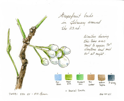
Grapefruit Buds and Early Formation of Fruit

For ink and watercolor this month, I chose to do these two pages first showing the initial buds and early fruit on our grapefruit tree.

Worked in handsewn journal using old stock of Fabriano Hot Press 140 watercolor paper, TWSBI 580 with new EF nib and #41 Brown.  I decided to use other than Sap Green for my greens...all Daniel Smith pigments.

Note about the TWSBI 580:  After working with the 580 and a F nib for a while, I purchased the EF replacement nib and definitely prefer the EF nib.  The TWSBIs I have all feed wet compared to other pens and the F nibs were feeding ink that took too long to dry.  With one sketch I worked even after 20 minutes smudged when I went to erase the pencil lines.  


Tuesday, June 8, 2021

Immature Ruby Red Grapefruit - Digital Drawing

This digital drawing has taken me quite a bit of time as I played trying to decide what to include and what not to include.  I would upload to my computer to analyze on a larger screen and from there would add or remove as I saw fit on my Ipad using Procreate. 

It was originally sketched as seen to include a weed stalk with thorns growing to one side (not showing as I removed it).  Point of view was looking down with only the ground showing and not the fence that stands behind the tree.

Originally the greens I was using were too much the same (to my eyes) so I made some subtle changes for a little variation but trying to stay close to how they truly look.

After I worked the progress sheet (I can refer back to), I made a couple more subtle changes to include adding a hint of a reddish tone to the ground and lightening the front grapefruit just a bit on the right side as I thought the color saturation was too strong hiding some of the texture I wanted to show.

Size of the fruit at this point are larger than a golf ball but smaller than a baseball.  They will continue to grow changing color and be ripe around the end of Fall into Winter.  The longer these stay on the tree, the sweeter they will be.  Once picked, they do not continue to ripen.  


Saturday, June 5, 2021

June Theme - My Diet - Veggies Pen and Ink

Continuing with the theme of what foods I like and try to incorporate into my day to day eating habits, I worked this page of vegetable doodles.

Many of the dishes I create use cauliflower and sometimes broccoli.  I love garlic and adding a touch of jalapeno for a little extra flavor and heat with most foods I eat.  Green Beans with onion and bacon is one of my favorites along side of the Kale soup we make.  For healthy snacking, I like sliced cucumber and tomato as I can't handle celery and prefer carrots (not shown) either grated in a salad or steamed.  Another major vegetable (not included on page) that I eat a lot of is Zucchini either grated or spiralized.  

Worked in 5.5x7 Fab Hotpress journal using TWSBI Eco with EF nib and Lexy Ink.


June 2021 Monthly Theme - My Diet

Tonight I was in the mood to start my theme also using graphite.  Instead of a mechanical pencil, I chose to grab a regular 4B drawing pencil after a friend of mine shared his pencil sketches with me earlier in the day.  One of the things I love more about a regular pencil is being able to use the side of the lead.  The two big drawbacks, however, is the smudging using a softer grade pencil and the fact the lead wears down requiring sharpening.  

Monthly theme for June is "My diet" sketching/painting a minimum of three to six items that might fit the theme.  Not to mistaken "dieting" but instead foods I am eating at this point.....good or bad.  I'm TRYING to get back to eating healthier foods as I've been on a very long binge of eating comfort foods causing some health issues I'd rather not be dealing with.  It's difficult when one can't sleep and all those extra hours of being awake results in my wanting to eat....normally sweets or high carb foods such as bread and other highly processed foods.

One of the dishes I like to eat that is actually healthy is Kale...minus the bacon we use for flavoring.  Although it's actually not too bad with the number of slices used in the size pot of Kale we make.  We like making what some might consider a soup.

A very simple recipe using a bunch (as packaged at the store) of Kale, three to four slices of bacon, onion, and jalapeno pepper (just to add a slight kick but not too much heat) sautéed in the pan and then simmered together in about three to four cups of water.  I could sit and just drink the broth.   

With this latest batch, I decided to add grilled diced chicken giving the "soup" some extra protein and body.  Next time we want to try using chicken broth instead of just water for extra flavoring to see which way we like best.  We may also add spinach which we've done in the past and really liked.

9 x 12" Alpha sketchbook using Mars Lumograph 4B pencil.


Premature Grapefruit in Graphite

It's been a couple of weeks since I've done any sketching.  Instead I have been taking a little break I evidently needed until the desire hit to pick up my sketchbook.

Terry had brought in a premature grapefruit he had to pull as it was putting too much stress on a limb causing fear it might snap from the weight.  We were supposed to remove ALL fruit this year allowing the energy to go into the tree itself.  He pulled all but about 12.  As I was sitting here looking at this particular one, I had the itch to sketch it...showing the size relative to my hand.  

Alpha sketchbook with mechanical pencil and .7 lead.


Friday, May 14, 2021

Ibis, Dessert, and Orchid

After the big disappointment with the Magnolia, I decided to redirect my interest in other things to sketch.

One of the days I went out to check on the Magnolia, these Ibis were in the back near the tree.  I was able to move around a bit without scaring them taking pictures.  These guys seldom come to the back yard so it was a surprise to me to see them there.


Terry went to get some ice cream for us and knowing I'm trying to watch my calorie intake, he found these mini cones.  Nestles makes mini drumsticks and I have always loved their large cones but Publix was out of them.  So he decided to get these from Blue Bunny for me to try. 


Last month I worked a watercolor sketch and a digital sketch of my orchid at the bud stage.  I wanted to work another digital with it in full bloom and got a bit carried away.  This took me hours starting yesterday morning at 10 a.m. and worked it off and on until 4:30 this morning.  Then I picked back up on it at around noon and finished this afternoon.  Today's work was fine tuning after a few hours of sleep and fresh eyes adding deeper values, blending and smoothing edges.


Tuesday, May 11, 2021

Big Disappointment - Magnolia Flower

So far I have seen and monitored two buds that opened and went through the stages up to all petals turning brown.  There was another bud ready to open as of last night I was so looking forward to seeing as there were no limbs or bunches of leaves to hinder the flower from opening completely.  

When I woke up, I went outside and took a picture of that bud and knew that sometime through the day, it would definitely open.  And I was right.  UNFORTUNATELY, sometime during the day, something attacked this flower leaving petals on the ground exposing an entire side of the center.  Chances are it may have been squirrels as we have an over-abundance of them this year eating up our growing avocados and causing havoc at our bird feeders.  Neighbors are also complaining about how bad the squirrels are this year.  One neighbor in particular has already trapped over two dozen (just from his yard) relocating them to the National Forest near us.

Last page in journal from Fay.  TWSBI 580ALR w/#41 Brown / QoR and DS watercolors.


Watching and Documenting Growth of Magnolia Flower

When we moved into the house we first rented and then purchased, we cut down all but about 6 feet of trunk of a scraggly looking magnolia we didn't think was doing well.  Our plan was to place a bird house on top hoping to attract Blue Birds.  We never got around to building the bird house and the next thing we knew, we had new growth growing from this trunk to include side branches.  Here a few years later we have a nicely shaped magnolia tree.

The type we have is an evergreen variety (Southern Magnolia??) that is showy with dark green leaves on the front or top surface and a gold/bronze color underneath.  The leaves are large and waxy.

We noticed the last two years the tree had actually produced a few flowers only because we saw the seed pods.  We kept missing the flowers themselves.  This year I was determined to see them and starting around mid April, I started locating a few flower buds.  At first I could only find three but have since noticed several others...mainly up higher.

At first it was hard to distinguish between leaf buds and flower buds but didn't take long to notice the difference.  The flower buds are fuller at the base looking like a bulb compared to the leaf buds.

Over the weekend we saw our first flower open in a cup shape.  Come evening I noticed the flower closed up.   Next morning I found the flower was wide open spilling stamens that would catch on the cup shaped petals.  By evening, the petals were turning a Burnt Sienna like color of brown.  My understanding is that the flower life is basically two full days before turning brown and petals finally dropping leaving a cone shape that continues to develop into seed pods.

As of yesterday we had two fully opened flowers - both at the point of petals turning brown.  There is one bud that is getting close to opening and have found several others at the point in this first sketch.

First two using sketchbook with Fabriano Hotpress paper.  TWSBI 580ALR (F) w/#41 Brown ink.  QoR and DS watercolors.


This one using same sketchbook but using TWSBI Eco (EF) w/Urban Grey ink / same watercolors.


Didn't feel like messing with watercolor so I worked this rough sketch in Stillman and Birn Alpha sketchbook using mechanical pencil .7

State of flower as of last night.


Wednesday, May 5, 2021

Monthly Theme May 2021 - Gnomes Pencil Sketch

Continuing with the monthly theme of "Items I tend to Collect," I worked this pencil sketch of three gnomes.  I have two sets of miniature gnomes done up in Gnome Gardens.  One garden has gardening gnomes while the other one has four camping gnomes.  

Outside we have a set made of resin that light up automatically at night.  And one other I have is a plush gnome I have inside one of our curio cabinets.

Gnomes are special to me because they remind me of the child's TV show of years past called "David the Gnome."  I used to sit with Travis watching this show and loved the moral lessons the show centered around like sharing, etc.

Stillman and Birn Alpha sketchbook / Mechanical pencil .7


Tuesday, May 4, 2021

Working Opal and Jake Three Ways

For my minimum of one digital for the month, I decided to play with different styles using my miniature dog and bear as models.

Using a digital pencil sketch of Opal and Jake, I loaded into a separate Procreate file and worked as follows:

The first is trying to follow how BeeJayDel works his cartoon characters.  He has his ink line sketch and then creates a  layer for a flat base color where he drags and drops a color.  Then he works a layer for shadows and a layer for highlights.  His shadows and highlights are hard-edged.  One of the problems I find myself facing is where and how to place these hard-edged shadows.  He's big in shadows and conservative with his highlights.

The second is using the exact same colors but softening those hard edges of both shadows and highlights.  

The third version is painting the colors in (using gouache brush tool) rather than dragging and dropping a flat base color.  That way the illustration has texture simply by the brush strokes saving a step and additional layer using a texture brush over top of a flat base color.  I also changed the colors used in Jake (dog).

I prefer the soft edges in shadows/highlights so the middle is my favorite of the first two.  Overall, however, I prefer to paint my colors in instead of using a flat base color.  


Pen Versus Paper

For my goal to work at least one straight pen and ink sketch for the month, I started sketching these simple flowers.  I started in one of the hand-sewn books I made year before last using up old stock of Fabriano Hotpress paper.  I've not had issues before but I sure did with this page.

Using my TWSBI 580ALR with fine nib, I felt this drag like I would imagine trying to sketch on waxed paper.  The ink went down very light almost like it had been watered down.  Going back over those lines, the paper then grabbed the ink making areas super dark.  

Not real happy with the results but then I really didn't feel like putting much more effort into this due to the way my pens were behaving on this particular page.  The following two pages didn't give me trouble so I'm keeping my fingers crossed I won't run into this again with the remaining pages in my sketchbook.


Sunday, May 2, 2021

Something Totally Different

No idea what prompted me to look into family crests but I spent awhile looking at those, wedding crests, and mono crests.  I was intrigued by those not traditional with shield and armor and started thinking about what I could come up with that fits me.  And rather than designing all new content, I decided to go through my previous sketches and paintings and use some of my favorites.

This would be classified probably as mixed media digital since I used both digital and watercolor sketches to make this up and designed it in photoshop elements.

This represents my favorite bird which is the hummingbird.  It includes my favorite colors which are greens and golds.  Green represents nature and life and golds represent warmth and comfort.  This "crest" represents my love for art, fishing, gardening, and includes my favorite sketching model, Opal.   And the quote is how I live. 


Printed and placed in a magnetic acrylic block using old stock of Arches Infinity Museum Quality Digital Art printer paper (I found another box I hadn't used yet).  My go to for ATC cards before Canon partnered with Arches and that particular paper is no longer available.  This was always my favorite before finding Red River papers.  The one thing I like about the Arches was the texture of the paper.  Red River Aurora that I purchased is more like a hotpress surface but is bright white and makes your prints pop.  Arches Infinity is a softer white with a coldpress like texture.


Saturday, May 1, 2021

Monthly Theme for May 2021 - Items I Tend to Collect

Alexa chose the number assigned to "Items I tend to Collect" which covers quite a few ideas I can sketch this month.  I have quite a collection of pens, various trinkets, and stuffed animals to include my miniature bears.  One of my biggest weaknesses is collecting various cases.  

Most normal women get into buying/collecting dozens of shoes and/or handbags but then no one can call me normal.......ha ha.  I find a handbag I like and I'll use it for every occasion until it falls apart.  And shoes......I have two pairs of dress shoes (navy and black), pair of sneakers until they wear out, and pair of flipflops ... given the choice, I go barefoot.  I never got into matching shoes with clothing or handbags like many women do.  And as for clothing, my wardrobe is very simple with maybe a dress or two, t-shirts, a few blouses, and jeans.

Anyways......for my first example for this theme, I went with a few cases I have sitting right here near me that hold mainly pens but also a few other art supplies to include drawing pencils.

Second to last page in the journal Fay made for me / TWSBI 580ALR with Urban Grey ink / QoR watercolors.


Graphite - Magnolia Bud

To start off the month, I worked this graphite sketch.

This is the stage of our Magnolia as of 4/18/21 we tend to miss out on with the few flowers the tree produces.  This year I've been able to spot three buds I'm keeping an eye on.  

Bud with a leaf behind it.  

Mechanical pencil .7 in Stillman and Birn Alpha journal.


Wednesday, April 28, 2021

Printer Paper for Art Reprints - Red River Paper

Just wanted to share.........

Over the years I have tried various papers for printing art projects and frameable reprints.  Most of the papers I've tried I didn't like the texture or the results (often way too dark regardless of printer settings I could change). 

Years ago, I did find one paper I fell in love with called Arches Infinity Digital Art and Photo paper which is Museum Quality paper.  I had several boxes of 25 sheets and thankful that when I purchased that paper, I purchased several boxes because you can no longer get it.  I understand Canon is somehow involved with that and maybe they have an equivalent or use a different name for the same paper but I've tried various Canon papers and not impressed.

Running out of my stock of Arches, I started doing some research reading forums and reviews from photographers and other artists.  I came across a company mentioned by several called Red River Paper that specializes in Digital Art and Photo papers.  After spending some time on their website and reading comments by people who have purchased from them, I decided to give them a try......and soooo glad I did!!!

I ended up going with their Aurora Art White 285 which is 285 gsm / 72 lb paper.  It has a smooth (not slick) texture to it and is bright white, which I prefer.  

The site has specific information about their paper and my printer make and model (Epson XP-15000) as well as the program I use (Photoshop Elements 11) to print from.  The company provides printer paper profiles for each of their paper products and step by step instructions I was able to easily follow for installing these profiles on my computer and then a video showing the steps within my program for proper printer settings.

The results were better than those from my previous favorite paper!!!  I now have a new favorite!!

I was impressed by how quickly the company processed my online order.  I ordered after their cut-off time on Friday afternoon so I knew I would have to wait until Monday before it was even processed.  Monday I received an email stating my order was on its way with expected delivery by Wednesday (from Texas to Florida).  I chose their lowest priced shipping which ended up being via FedEx and not USPS.  

Also impressive was their packaging!!  It seems many companies these days do not take proper care in packaging things like this resulting in dinted corners or worse.  I've ordered reams of paper through various places and either paper corners are dented from bouncing around inside the box or the paper packaging around the sheets of paper busted at the seams (as in my last order from Staples).  Another issue is when at the businesses, people opening the cases using box cutters slice through the top reams (also from my last order from Staples) resulting in several sheets unusable for printing.  With Red River, that was not the case.

The paper I ordered came 50 sheets to a box...a nice sturdy box with lid that is sealed with shrink wrap (or whatever it's called).  They added a piece of cardboard for additional padding and packed in yet another box for shipping that fits tight around the box of paper (at least in my case with one box ordered).  Inside the paper box was an information sheet about the paper and general recommendations on using the paper in one's printer.

So by sharing this and anyone reading facing a choice in art printing paper, maybe consider this company.  And I'm sharing this strictly on my own behalf knowing what it was like with all the hours of research I went through to find this paper as well as the money spent on trial and error of other papers.  

Monday, April 26, 2021

Chrysalis Two Different Methods

One of our neighbors with children raise Monarchs and while Terry was out walking Miya, he was called over to check out butterflies emerging from their Chrysalis.  He came back to the house to get his camera and went back over taking pictures and learning more about the process.

This family plants Milkweed in pots to attract Monarchs.  Eggs are laid followed by the caterpillars.  These caterpillars are fed the leaves of the milkweed to keep them around so they create their Chrysalis in the plants.  The family moves these plants inside a pop up screened housing you can purchase for this purpose and enjoy the time when the Monarchs emerge.  The wife also created a board with rope they hang under their outside porch light.  It's evident that the family takes a few of the Chrysalis by hand and tie to the rope where they stay until the butterflies emerge.  

How neat for those children to be apart of that experience!!!  I learned a lot from this as well.

Terry was told this continues until around October so we have plenty of time should Terry follow through with trying this himself.

From photos, I worked these both digitally and in my sketchbook.  I wanted the digital to be more like how I work in my sketchbooks rather than in depth or formal like I've been doing lately in Procreate (like the portraits and flowers, etc.).

This follows one of the photos Terry took - using Procreate and Gouache brush tool for color work and BJD's Standard Inker for line work and writing.


Then I decided to split between two pages as seen in my handsewn journal using old stock of Fabriano Hotpress paper (140lb).  One page worked with Urban Grey in TWSBI 580ALR and the other using #41 Brown in another TWSBI 580ALR foutain pen (both with F nibs).


Side Note:  When I started working on the hotpress paper with my fountain pens, I didn't like the feel of the nib moving across the paper.  I've worked on hotpress before and do not remember this at all even with EF nibs.  It felt like I was trying to draw or write on a paper with a coating somewhat like you'd find on wax paper.  And whatever it was appeared to collect on the nib and cause thicker lines and tiny blobs I didn't like.  At first my lines were real light and when I went back over them, it's like the grooves the nib made on the paper grabbed the next pass of ink and was really dark.  Was really weird. 

The first page I worked (out of three) was like this and I stopped what I was doing leaving the sketch unfinished.  I may return to that page later.  I decided to work on the next page for the above illustrations/writing and it was different.  I didn't have the issues on either of the next two pages.  I'm wondering if when making the books oil or something didn't end up on that one page.  Or maybe the old stock of paper I used is inconsistent with its sizing properties.  I won't know until I continue using this journal book.