Friday, July 31, 2020

A Scraggly Magnolia Transformed Unexpectedly

Years ago we cut the top off of a scraggly looking magnolia tree in our back yard with the intent to leave a good portion of the trunk to place a bird feeder on top.  Time got away from us doing other things and the next thing we knew, that truck started sprouting new life.  As it grew, what once was scraggly looking, took on a nice shape with leaves filling in from bottom to top due to the new branching lower on the trunk. 

The last couple of years we hoped to see flowers but never did.  However, last year, my husband found a seed pod indicating it had indeed produced a flower.  This year we didn't think to watch for flowers with everything going on with the virus and whatnot so we missed it flowering again.  This year four seed pods were discovered when mowing the lawn.  At this point they are white...still forming, and I look forward to when they have developed the seeds and the pods dry.  I like collecting things like that for sketching purposes.

Journal with Fabriano Hot Press paper / Metropolitan with DeAtramentis Dark Green and Noodler's #41 Brown.  DS watercolors.


Thursday, July 30, 2020

How a Game Can be Educational

Back in March, a new game came out called Animal Crossing New Horizons.  It launched just as the pandemic was spreading across the globe.  The game has been an escape for many people..being able to relax and concentrate on something positive.....living on an island and building it up for other residents.  For me it has definitely played a major role in maintaining my sanity and keeping me from being glued to the TV and computer following the day to day depressing news.

Several of my family members have also been playing and it's a way for us to interact even 1000 miles away from one another.

Aside from the escape from reality, providing endless hours of fun and relaxation, it also has an educational side to it.  One is interacting with the villagers/residents.....teaching kindness and giving to others....being neighborly and watching out for one another.  Another is learning patience (at least for me...ha ha).   It teaches responsibility and working hard for those things you need or want.  And it teaches about responsible spending and saving of Island money for bigger purchases.

There is the creative aspect as you craft many different type or style of items to include tools and furniture; but, a major bonus comes with the ability to design the island itself........setting up and decorating your island.  It even goes so far as earning the ability to transform the island's cliffs and rivers/ponds.

Then there are the numerous type fossils, bugs, fish, and sea creatures you may never have heard of before.  I find myself as I catch various creatures wanting to look them up as they are in real life, learning their origins and facts about their existence.

One such sea creature is the barnacle.  I've had a cluster purchased several years ago on a visit to Rockport, TX.  I never thought much about it except that it was a neat looking shelf ornament for my sunroom.  After swimming and diving (in the game) and catching one, I was intrigued to find out all I could about it.  To me it was just a shell ornament but learning about it as a living organism has been very enlightening to me.  Same goes for several other life-forms like butterflies and fish.  The fossils you dig up and end up pieced together teaches about the dinosaurs.  Within the game these items are donated to a museum with fact sheets near the displays.

Anyways......today I decided to do this quick sketch of the barnacle considering I have a cluster here at home and wanted to journal about it after learning the facts.


Wednesday, July 29, 2020

A Fruit I Doubt I'll Ever Try

Terry brought inside a Guava fruit he found on a small tree along the property line between our neighbor and ourselves.  This particular one was probably beyond ripe as it was feeling rather soft.  When he brought it in, he made a comment it smelled like RAID Ant and Roach spray.  I didn't have to get close to it as I could smell it as soon as he came into the house.  To me it smelled like a strong onion and citrus combination.  We didn't keep it inside as the odor/fragrance was so strong, you could smell it from the back room of the house.  I took pictures of it quickly and decided to work from photos rather than it sitting on my table.

According to what I've read, it's very nutritious.....seeds and all.  It's suppose to be a very sweet fruit with a unique flavor between a strawberry and pear.  All I know is that the smell alone puts us off from even wanting to try one.

After taking the photos of the one, we walked outside and I took several photos of the fruit growing which are all still green ranging from small to medium in growth.  We couldn't find another ripe one hanging from the tree.

Worked in my 7 x 5.5 journal with Fabriano Hotpress paper / Metropolitan with #41 Brown ink (for wording) and Daniel Smith watercolors.


Wednesday, July 22, 2020

Handcrafted Dolls Sketch

Years ago I used to be big into fabric crafting ornaments and other small items like dolls and angels.   This morning I decided to work a sketch of two of my favorites. 

I am still using the Ipad and the app, Procreate to produce these sketches.  It takes me longer to work these using the Ipad than it would using traditional paper, pen, and color but providing a nice challenge as I continue learning what this app can do.  I find I enjoy the process more than the results versus feeling the need to fill a sketchbook and focused more on the results than the process.  This change is what is helping with inspiration and motivation to do any sketching.

When I started out with this one, I started with the line drawing like I would a pen and ink drawing.  The Studio Pen brush tool was used for the line work.  Then I chose to use a brush tool I'm not familiar with - Watercolor brush tool.  At first I didn't care for how it put down color but I stuck with it.  It lays down transparent layers you have to build up but after I got the hang of it plus blending, it wasn't so bad.

At first I was going after the ink and wash look but then once I reached a certain point (as seen in the center image), I decided I didn't want that.  Instead I removed the line drawing layer and using darker matching colors, I defined the edges and added more shading as if I were using just watercolor with no pen and ink.

This shows the process as I was working along with the change and notes I made to refer back to.

Total layers used in this one is 20 not including the signature and background layers.


Monday, July 20, 2020

Same Subject Different Brush Tools

Today I decided to sketch this anchor and then using Procreate, worked with different brush tools just to compare results.

The first example (top left) is using the category Inking - Studio Pen brush tool.  I never changed the brush size and the little bar tells me the size used.

The second (top right) is using the category Drawing - Little Pine brush tool.  I've never tried this one before.   I used the same size throughout.

Third example (bottom left) is using the category Sketching - HB brush tool for line drawing and Shading Graphite for the shading.  Size brushes shown in the little bars.

Final example I decided to use color.  This time using the category Painting - Acrylic brush tool.  Line drawing was using the same HB pencil sketch using the size the bar indicates.  With the color, I used different sizes depending on area I was working.

Each were worked in layers as I normally do but with the color, I decided to only work one layer with both orange and black for blending purposes.  In the past I would use a separate layer for each color.

This was a fun exercise and I may do others trying new brush tools I've not used before.


Sunday, July 19, 2020

Pencil Case Sketch

This morning I was up early and rather than turning on the TV or playing games, I decided to try and sketch something.......anything.  Instead of looking around hoping something jumped out at me to sketch, I chose to sketch the first thing I saw sitting in front of me, which happened to be my pencil case.

I'm still lacking motivation and this slump I've been in is really starting to bring me down.  I so want to get past it!!

I think part of my problem is lacking purpose for what I do.  It used to be straight forward in my reasons but somewhere along the line, I started questioning those reasons.  Now I'm dealing with a great deal of confusion and just not sure what direction to take to regain a sense of purpose.

This is digital sketching using Procreate and Ipad using the HB brush tool and the Pastel brush tool.


Thursday, July 16, 2020

Family Trip to Ripley's Aquarium - Myrtle Beach

My eldest son and his family were to come to Florida for a week the last part of June and then spend a week at Myrtle Beach.  Unfortunately with the explosion of COVID 19 cases over the last few weeks here in Florida, my son's employer told him if he came to Florida during his vacation, he would be forced to stay home for 14 days without pay upon his return.  So the family decided best to post-pone their trip here saving for a later time.

While they were at Myrtle Beach, they sent me pictures of their outings, which included going to Ripley's Aquarium.  One of the photos was of penguins (which I love), so I decided to add a sketch of one of the penguins in my journal.

Fabriano Hot Press / #B Wolf's Carbon Pencil

When I set out to do this, I intended on including two penguins........one laying down to the right of the one standing.  Unfortunately, I started with the one standing and realized I didn't leave enough room to include the other one without chopping off his head.  Needless to say, composition leaves a great deal to be desired. 

If I were to print this, I would crop out around the penguin like shown below.


New Pens - Metropolitans

Not that I need any more pens but I treated myself to three Metropolitans after learning they came in other than black or gold like back years ago when I first bought two.  I like the nibs on these pens compared to the Lamy nibs.  Fine nibs in the Metropolitans are like the Lamy Extra Fine nibs but not quite as scratchy.

Although the site says they no longer come with converters, the three I purchased did.  The type that came were the squeeze type converters I've never used before.  Will be interesting to see how well they work and how much ink they hold.  I also purchased the Con40 converters but quickly learning I don't care for them.  They do not hold very much ink.  I'd rather refill an old cartridge than to use those converters.

I have filled each pen with DeAtramentis Document inks of similar colors to the color of the pens for easy identification.

Illustration worked using watercolor pencils dry.  Worked in journal with Fabriano Hot Press watercolor paper.

UPDATE August 4, 2020:  The squeeze type converters seem to be doing OK.  The Con 40 converters are absolutely useless!!!  Other people stating they don't hold much ink is an understatement.  Plus, I find I have to physically turn the piston to push ink up towards the feed in order for it to continue feeding ink. 

Thursday, July 9, 2020

July Challenge - Notan Concept

Fighting a major art slump, I started doing some surfing hoping to find some inspiration and came across a term I hadn't heard before......Notan Art.

What I found first was related to paper crafting where you use black and white paper cutting out shapes from one color paper and creating a mirror image by pasting the cut pieces on the other color paper.  Something like this illustration I did.

Notan is Japanese for Darks/Lights.

Not wanting to use actual paper, physically cutting out and pasting shapes, I decided to emulate that process using Procreate on my Ipad.  My first trial was using my miniature bear, Opal, and sketching out the contour shape working black and white.  Then I decided to go one step further by repeating using complementary colors.

As I continued to research Notan Art, I came across where people combine it with Zentangles.  Using Opal in black and white, I proceeded to add some doodling of repetitive marks for added interest.


Intrigued with the black/white results, I dug even deeper and learned that the Notan Concept is used in sketching and painting.  A lot like value sketches one might do before going into a formal painting and incorporating the negative painting concept as well.  At least this is my understanding or perception of this whole process.

Great article on the principle and usage of Notan when painting.

Another web page that includes a couple short videos.

Playing with the various ideas found in my research, I worked the following.  A couple taking it further adding other values.

The first example with the cranes I am not real crazy about.  Not so much the technique but the composition or layout of the dark areas versus the light.  It was worked from a photograph and I feel after seeing the placement of values that I chose a poor photo to work from.

Went back and chose a different photo...one I had used before as reference for a sketch I worked in one of my journals....re-worked the three-value by mapping out the darks and lights.  I definitely like it better.  I chose to leave out the pole in the front and add more foliage to frame the cranes.


This next is another that I worked from a photo which has turned out to be one of my favorites.  I like the balance of black/white areas.  I sketched the one black over white and then cut/pasted the one with the white over black (digitally speaking).


Next is a grouping which includes the above and a few others I worked for the July challenge.


As a twist to the above, I also worked this last one adding in color after the initial black and white.  After adding color, I change it back to black and white mode to see the value range I achieved by adding the color.


This shows the steps I used to create this before adding color.


After a long dry spell, I am really enjoying this exercise playing with only lights and darks.  To me it is intriguing and a nice break from worrying about color or being so detailed.  The bonus is learning something from this with values and placement within a composition.

An added bonus to working on the Ipad, I learned a few things with my Procreate App I didn't know it could do.  GREAT, provided I don't forget what I learned.......ha ha.


Wednesday, June 10, 2020

Carnations from Flower Arrangement

Struggling now for going on two months with this art slump I'm in, I managed to work this digital painting.  I tried a week or so ago to do some sketching but just couldn't force myself to accomplish anything.  This morning I woke up and actually felt that "itch" to do something as I looked at the bouquet of flowers Terry brought me last Sunday.  Still not ready to deal with watercolor, I grabbed my Ipad to work this illustration.

Love the color in these carnations!!  And they have such a nice fragrance to them, as well.  Other flowers in the arrangement include tiger lilies and various color mums. 

For a change, I didn't overthink things resulting in my feeling overwhelmed by all the petal details....I just jumped in and started adding color and blending. 

Procreate Digital Painting / Airbrush Med and Soft brush tools


Leaf Footed Bug

This was done back in April as I was fighting the beginning of an art slump I'm still dealing with.  Just now catching up posting this plus I managed a digital painting today I will share in the next post.

This is a Leaf-footed bug crawling on the front porch back in April.

It was late and I was tired when working on it so no surprise I misspelled "CREEPY"   Although not something I'd want to land on me, I do find them intriguing with their unique shape.

Fabriano Hot Press / Hand Sewn Journal / DS watercolors / Document Brown but can't remember which pen I used.


Tuesday, March 24, 2020

Mockingbird Gathering Nest Material

Spring is such a busy time and joy to watch.  We learned a pair of Mockingbirds are building a nest in our Bougainvillea in the front yard.  No idea if male or female but this one was right outside my window gathering twigs it could find.

Wasn't in the mood to mess with painting so I chose to work this one using Ipad / Procreate and the HB brush tool.  Good practice with values.


Monday, March 23, 2020

Birds and the Bees

Early this morning, as I drank my first cup of coffee, I watched this Brown Thrasher "thrashing" at the ground to move leaves and debris looking for food.  Another was checking out the flat feeder of sunflower seeds. 

This guy was up under the Azalea bush near my window taking a break.  He sat there for quite awhile before returning to task at hand giving me plenty of opportunity to take several photos.

I haven't learned to tell the difference yet between male and female.  I understand that if guarding a nest, they can be quite aggressive attacking people and dogs.  They are quite large song birds and one I wouldn't want dive-bombing me with that large beak they have.

During the summer we don't see them around the feeders like we do during late winter and early spring.

Journal with Fabriano 140lb HP / Pilot Prera w/#41 Brown / DS watercolors


Yesterday I was looking out the window when a bumble or carpenter bee hit the window.  Not just once but twice.  Once he realized there was an obstruction there, he went on his way.  You would think the first time he hit the window, he would have moved on. 

The bees never appear to be stunned like the occasional bird that hits the window.  If we find a bird stunned and on the ground, we will move the bird to the back yard so our neighbor's cat can't get him while he recovers.

Journal with Arches 140lb CP / Pilot Prera w/#41 Brown for sketching and Lamy with Doc Ink for writing (the Lamy handles the toothy paper better when adding notes) / DS watercolors


Sunday, March 22, 2020

Playing - New Shadow Mix

Painting shadows.......particularly cast shadows has always been an issue for me.  Putting in shadows tend to intimidate me for some reason..........no matter how often I practice.

Most often it has to do with the color of the shadows never turning out how I like.  Either too blue / too lavender, etc., too stark or streaky looking.  Personally I prefer subtle shadows over bold.

I've tried mixing complementary colors together, mixing Blues and Siennas or Umbers together, and even using premixed tube shadow colors.  I seldom felt satisfied with the results.

My friend, Fay, shared a combination she recently tried using Potters Pink with Cerulean Blue.  I didn't have Potters Pink but instead Opera.  I tried that and although I could come close to her gray mixes, the results were a bit "too much.....too intense" for my liking.  Aliz plus Cer Blue didn't quite make it either.

Finally, I picked up a tube of Potters Pink and have to say I love the results with it and Cerulean Blue.  I also like the granulation achieved which to me adds a bit of interest.

This is my playing a bit this morning shading white objects.  Painted in Journal with Arches 140lb CP


Friday, March 20, 2020

Have You Considered Making Your Own Journals?

With everything going on and people staying home due to the Coronavirus, now might be a good time to try your hand at making your own journals. The major positive is having journals with paper you love whether it's one type and brand or a mixed journal of various type papers you enjoy using depending on the mediums you like to use.

Although a little time consuming (which might help with the down time at home), it's really not that difficult once you know where to look for instruction and what to do. Once you finish and you hold that journal in your hand, you'd be amazed by the pride and joy you feel knowing YOU created the book sketching and displaying your artwork.

The easiest of the home-made journals are probably the accordion style (similar to what's shown here) where you fold and cut a full sheet of watercolor paper and simply glue mat board either plain or covered in fancy paper to front and back.

Another easy type of home-made journal would be cutting full sheets of paper down to the size you wish to work on and having it spiral bound...either by purchasing equipment to bind your own or later having it done at a print shop or local office supply. I think the postal service or UPS might do it also for a fee but not sure on that. I have my own binding machine so my knowledge is limited to what's offered out there.

One of my favorites and easy to make would be the Traveler's or Midori style journal with paper cut to preferred size and using a thick piece of faux leather for a cover plus elastic bands to hold your paper in place. There are various ways to make the covers from simple leather/faux leather to sewn fabric covers or even hard casings (which I haven't tried yet).   My favorite are the fabric sewn covers I made a couple years ago for myself and as gifts for several people.

Not only were the journals fun to make but I so enjoyed making charms to hang for that little added interest.

For me, I love all of the above type journals but I have to say the most rewarding has been the hardbound fabric-covered, hand-sewn journals I've made. I have several posts I've made about the various hand-made journals but thought I'd write this one......an update summary of sorts with a pdf I've created that helps me remember what to do that others might find helpful.

This pdf is specific to creating 5 x 5 1/2" size journals. Except for how to cut full sheets for other sizes, the rest is basic information for any size you decide to go with. 

The first two pages of the document is a basic outline I created for myself laying out the steps followed by instructions and images.  Besides the tab at the top of my blog named "Bookbinding," there is  a link within the document to my post of the most helpful videos I found to create my journals.  Sea Lemon is wonderful and easy to follow.

Bookbinding 5x55 BooksCOMP 


So if you'd like to find something different to work on.........challenging but fun to do, consider trying your hand at making your own journals for sketching and painting.  

Our Hibiscus and Exercising Right Side of the Brain

One of my favorite flowering shrubs is the Hibiscus.  We have a couple orange flowering shrubs that were here (in the ground) when we moved into the house six years ago as well as a couple double peach Hibiscus.  Since then we've added a red and my youngest son gifted me with a tropical (Hawaiian I believe) that is multi-color with red, yellow, and white.  Last year I mail ordered yet another double peach with these new additions in pots until we decide where we want to permanently place them.

The Hibiscus basically bloom year round......even during winter.  The only issue we have are aphids as they too love the flowers.

First illustrations I worked sketching on my Ipad, using Procreate, and Apple Pencil.  I printed off onto regular bond paper and then decided to use watercolor pencil (dry) on one of the illustrations but left the other two as ink only sketches.  Used Technical and Fine ink tool brushes.


Yesterday I decided to exercise my brain a bit using the "Right Side of the Brain" exercise where I had the illustration next to my journal page and did my best to slowly copy exactly what I saw line by line.  It's really interesting when you can actually "feel" the right and left side battle one another to take control.  I'd be going along just fine with eyes on first illustration and hand making marks on journal page and then it was like the left side wanted to take control and my hand going off in a different direction or angle.  Between the level of concentration and battle going on inside my head, I found my hand becoming a bit shaky and glad I was initially doing this with light pencil.  By the time I was done, my hand was too shaky to start in with pen and ink so I waited awhile.

Still a little shaky, I proceeded with pen and ink.  It was actually a good thing as I felt it helped with a more spontaneous looking line but then maybe just my imagination.

If one didn't know better, one might think I had traced these as I came real close and feel good with the results from this exercise.

Journal with Arches Coldpress / Pilot Prera w/#41 Brown / DS and QoR watercolors


Do You Save Your Blog Posts?

One of the things I do is save all my blog posts.  My blog is an extension to my actual journals where space is limited on a page for various notes and things I want to remember.  It's also a backup to my blogger.

Before I used a site called Blog 2 Book by BookSmith, which is easy to use but limited with format of blog posts and how images show up in the final document.

Last year I decided to manually save each post using Microsoft Word.  It's part of my posting routine now where I create the post on blogger and then copy and save to the word document.  I can then further format font and image size (without any preset sizes).  I keep a word document for each month with all the posts I share here on blogger (some which I create using blogger but do not make public) and once complete, convert a copy to a pdf where I can upload to Ipad or other electronic means.

My files are named with year first and then the month.  I've also been playing with making fancy covers for digital files uploaded to tablets, etc. but also keeping copies with the plain cover providing a choice if I choose to print.

My own personal art books I can share with multiple family members.  One of the reasons I like posting steps of how I went about doing things (when I remember to take photos or scans as I work.)


Tuesday, March 17, 2020

Flamingo Flower Gift to Me years Ago

Between the wildlife I see everyday, flowers blooming outside, and plants/flowers growing inside, I have plenty of subject material to work on to keep myself sane during a trying time.  Although I may follow news updates just to keep informed, I do make it a point to unplug for long stretches each day and do other things as a break from it all. 

Today's sketch is my Flamingo Flower plant that was gifted to me by my brother-in-law a couple years ago working in my Journal with Fabriano Hotpress  / Pilot Prera w/F nib and #41 Brown ink / DS watercolors.

Lately I've been working between two journals with very different papers and different brands.  One is made up of Arches Coldpress with quite a toothy surface (especially when working with pen and ink) versus the smooth surface of Fabriano Hotpress in another journal.  With each, I find I have to work differently in how I apply my watercolor washes.  In addition, I have to work with different pens and even inks due to tooth and also in how long it takes the ink to dry on the two different surfaces.  For me, it's fun and challenging.

Another thing I like to do is change my order of how I work pen and ink and the watercolor wash......just as a change and the challenge it provides as well.


Sunday, March 15, 2020

Loaded Loquat March 2020

This year our Loquat tree is loaded with fruit.  Best it's been in the six years we've lived here.  Trying one yesterday, I found it sweet and tangy whereas when I tried them before, I thought they were rather sour.  So it seems this year has produced a nicer crop all the way around.

I love the leaves and overall shape of the canopy.  With it loaded with the bright yellow/orange fruit, it's really pretty looking.

Journal with Fabriano Hotpress / Metropolitan fountain pen with #41 Brown / DS watercolors (New Gamboge, Quin Rose, touch of Aliz, Sap Green, Ultramarine Blue, Warm Sepia, Paynes Grey)

Steps photographed along the way:


Final with this being a scan of the sketch.


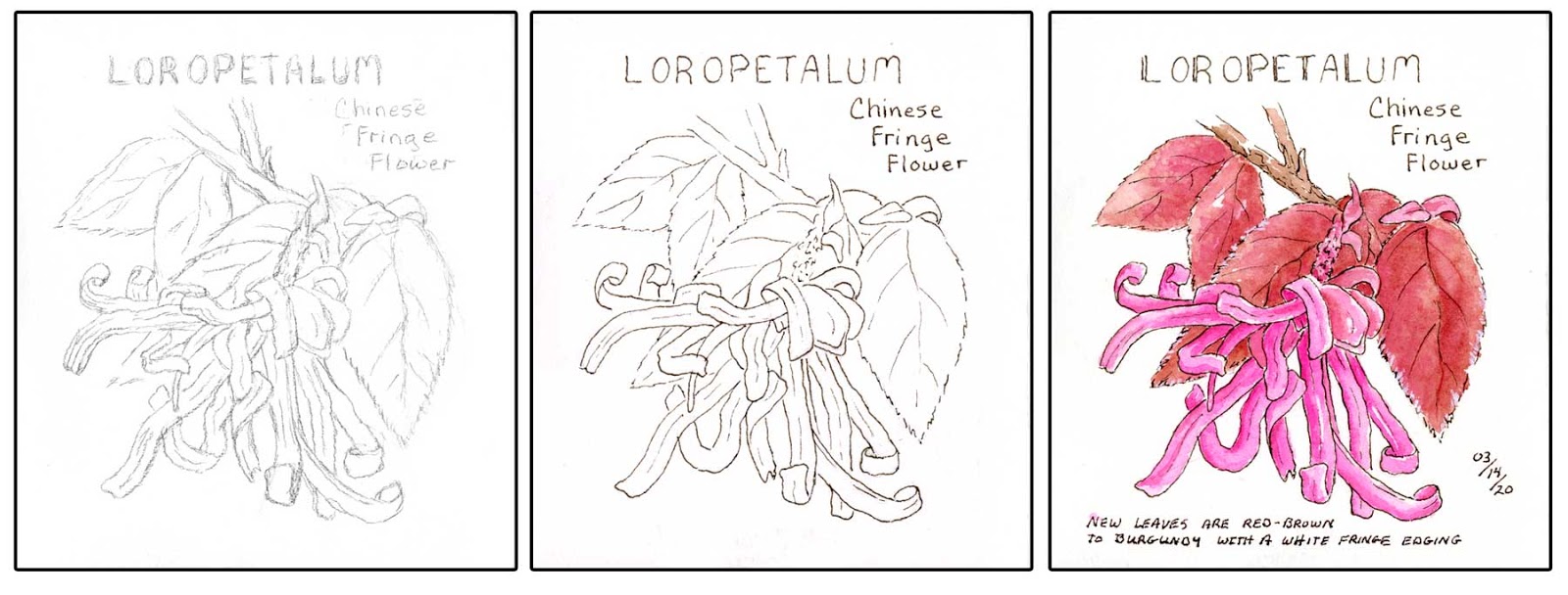
Chinese Fringe Flower

Today was another beautiful sunny day.  Early afternoon it was 80 when I spent a little time outside with a nice slight breeze.  These evergreen shrubs line the front of our house and are springing to life with new growth as well as flowers blooming. 

Beautiful shrub even without the flowers due to the contrasting reddish/brown to burgundy new leaf growth against the older green leaves.  Leaves have a white fringe like edging and the flowers are little bundles of ribbon like petals.


Until today, we had no idea what shrubs these were.  After doing some research, we learned they are Loropetalum....also called Chinese Fringe Flowers.  They are in the family of Witchhazel and cold hardy in zones 7-10.

5.5 x 6 journal with Arches watercolor paper / Metropolitan with #41 Brown / W&N and DS watercolors.  Pink is Opera and the mix I used for the leaves was W&N Light Red mixed with DS Quin Rose.