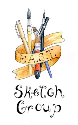
 This is me playing around with lettering. I've been playing on the Ipad, a chalkboard, and in my sketchbooks. This one is worked in a sketchbook.
The sketchbook I'm using is not one of my favorites as you really can't work watercolor on the paper surface as you can true watercolor paper. This one in particular is Global Arts Handbook which I think is better suited for drawing.
F.A.S.T is the abbreviation for the name of our sketching group (Fetch a Sketch Trekkers).
I've worked this particular illustration a couple different ways trying to decide which I like better. Trying different lettering styles, different art tools, various placement of lettering versus illustration, etc.
Below is an example of chalkboard play. I have to get used to working with chalk due to how easily it smears and then there's the dust factor I have trouble with.
The first one was using a piece of chalk straight out of the box and the second was after sharpening the chalk to a point.


2 comments:
I would sure like to see how the gal at Roosters on Oxford does hers.
It's an art to be sure.
Sharpening made a difference, didn't it?
Good job.
Their main chalk art may have been the wet chalk markers as their board was really clean around their letters. I can't use those because my board is porous. I could probably get the spray that seals the board but then might not work properly with regular chalk which I have. Not something I want to invest too much money in. Fun to play with what I have though :-)
Post a Comment